Careem Plus: from a new subscription to an everyday membership
This was a two-chapter product journey. First, we built Careem Plus from scratch: one subscription that made rides, food, shops and bikes feel like one connected service. Then, after launch data exposed an acquisition ceiling, we expanded the idea to offline partners.
Chapter 1: make the subscription easy to understand, join and manage
Chapter 2: make membership useful beyond Careem's own services
I worked with product, research and engineering from early framing through delivery. My focus was the full customer experience: explaining the value, reducing uncertainty at sign-up, proving savings after purchase, giving members control, and later connecting partner discovery and redemption to the same membership story.
Role
Product designer
Scope
0→1 subscription, then partner expansion
Platform
Careem Super App
Research
UAE, Saudi Arabia and Jordan
Launch
AED 39 / month in Dubai
Scale
48M+ Careem users across 13 countries
01
Building the core subscription
Starting Careem Plus from scratch
Turning separate Careem services into one clear, useful membership.
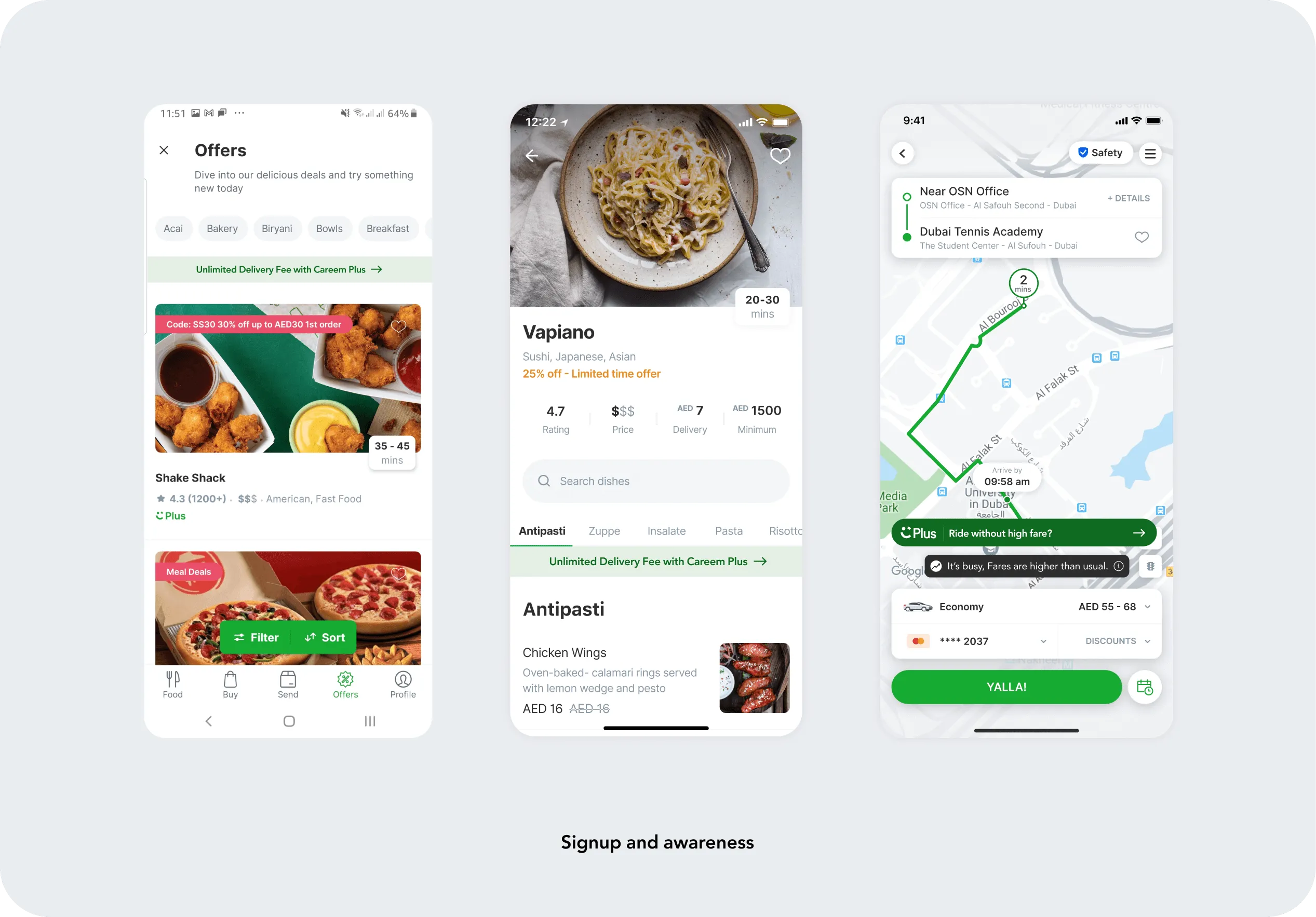
Careem already offered rides, food, shops and bikes, but each service built loyalty on its own. Customers had no single place to understand their benefits or see the value of using more than one service. For the business, that meant every transaction had to win the customer again.
The opportunity was to turn those separate services into one clear promise: pay AED 39 a month and save across everyday needs. The product also needed to create a more predictable revenue stream, increase multi-service use and give people a reason to stay inside the Careem ecosystem.
01
Explain
Can someone understand the value before committing?
02
Prove
Can a member see that their savings justify the monthly fee?
03
Give control
Can they get help, manage payment and leave without losing trust?
A brief look at how we worked
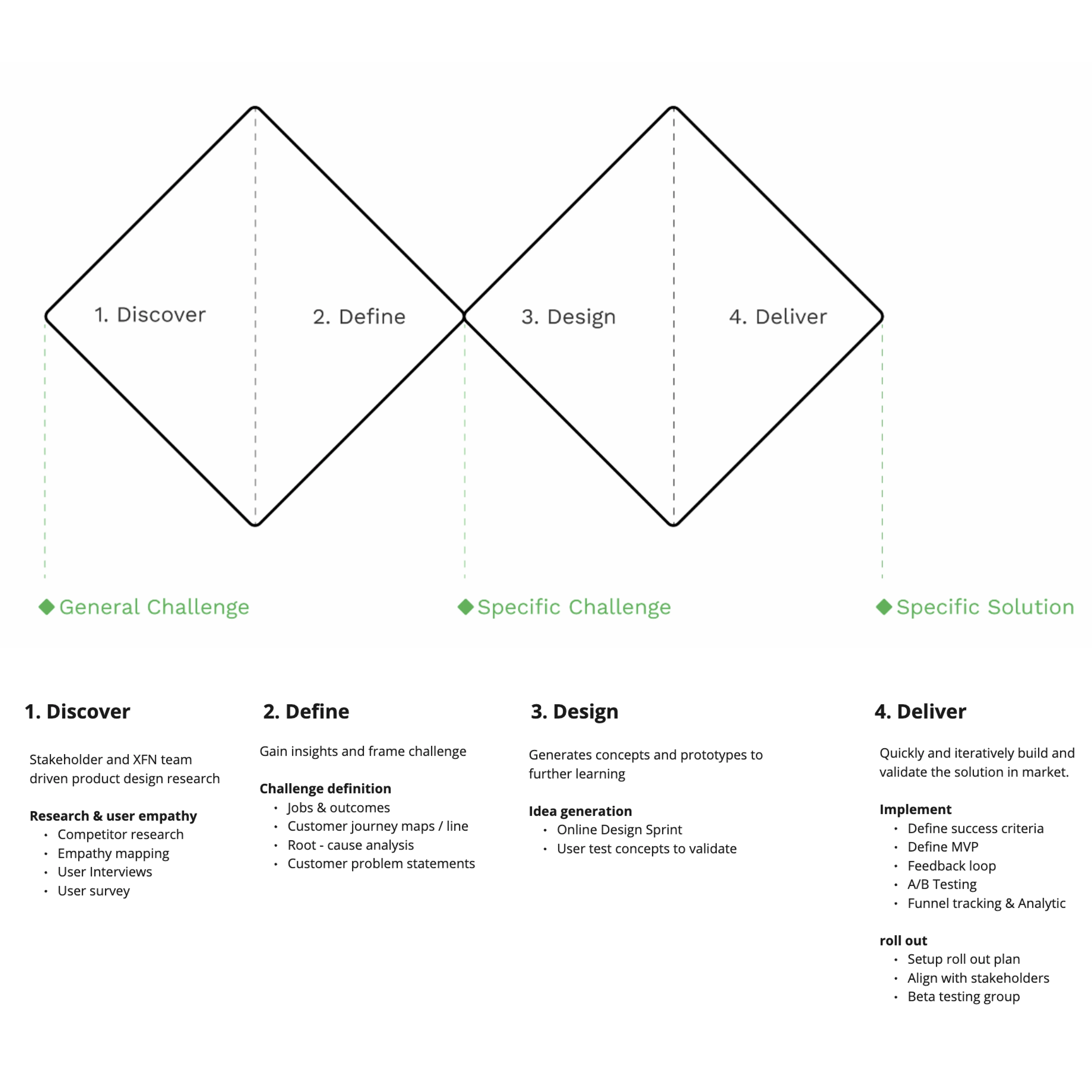
We moved through four practical loops: explore the customer and business problem, define the moments that mattered, prototype several ways through them, then validate and refine with customers and delivery teams. Story maps kept the full journey visible; wireflows exposed missing states; prototypes let us test the risky parts before detailed design. The work was collaborative, but I owned translating those inputs into the end-to-end product experience.
The framework gave the remote team a shared rhythm; decisions and feedback, rather than the framework itself, moved the product forward.
Research showed that one journey would not fit everyone
With a senior researcher and product lead, we spoke to customers in the UAE, Saudi Arabia and Jordan. We explored how people understood subscriptions, discounts and loyalty, then tested the journeys and interface flows.
The audience ranged from people new to Careem to single-service users, loyal customers, existing Plus members and people who had stopped seeing value in the programme. That range shaped a simple principle: give new customers enough context to decide, while letting familiar customers move quickly.
01
New to Careem
Limited or no context about Careem Plus.
02
Single-service customer
Uses Careem for one service, such as rides.
03
Regular Careem customer
Has used Careem regularly for six months or more.
04
Aware, not interested
Knows about Plus but does not see enough value to commit.
05
Careem lapser
Familiar with Careem but no longer uses it regularly.
06
Careem Plus member
Uses Plus benefits and saves across different services.
07
Careem Plus lapser
Knows the membership but stopped finding it useful.
We designed for different levels of familiarity, not a single ideal customer.
The experience, from first impression to everyday value
1
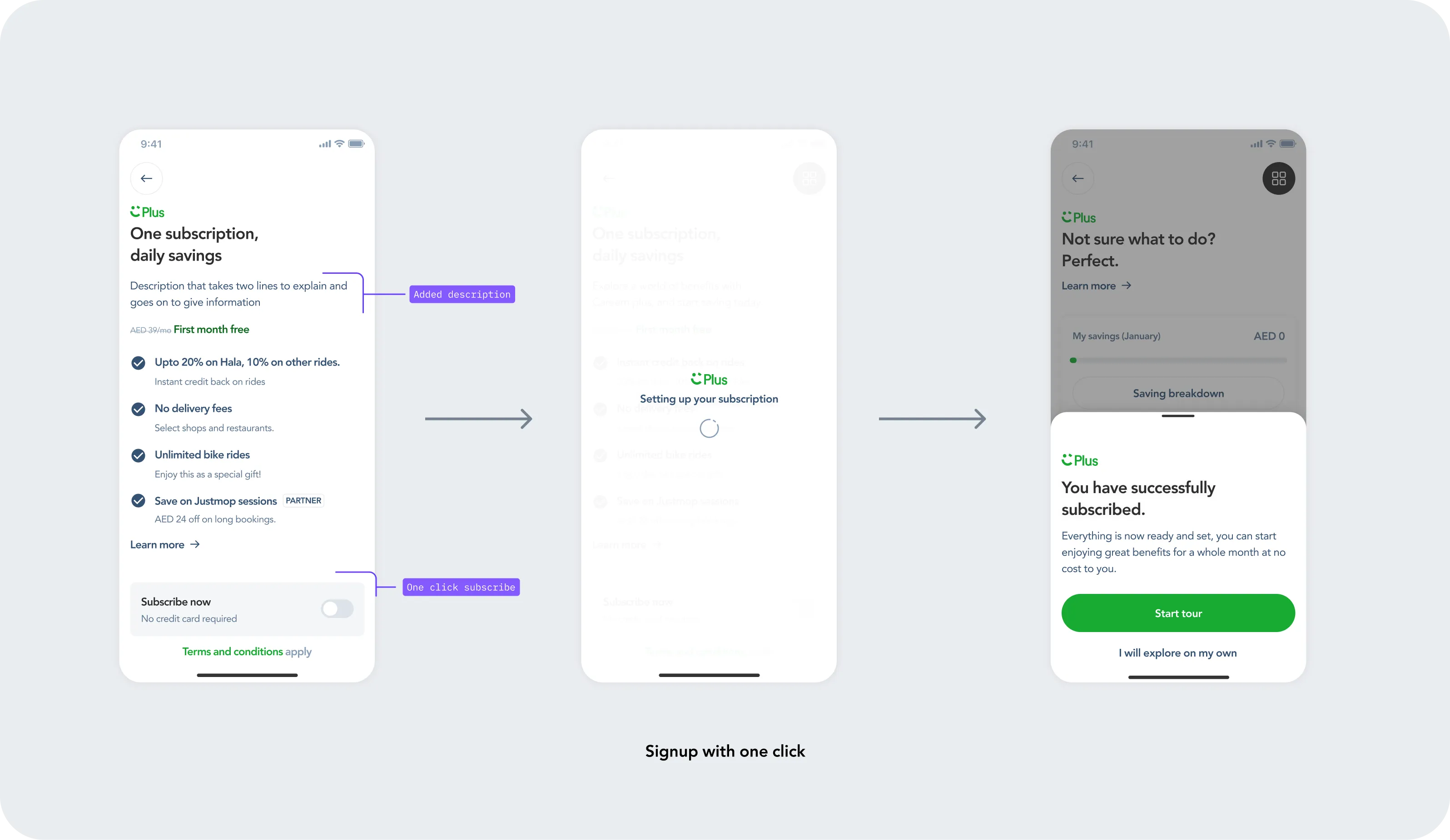
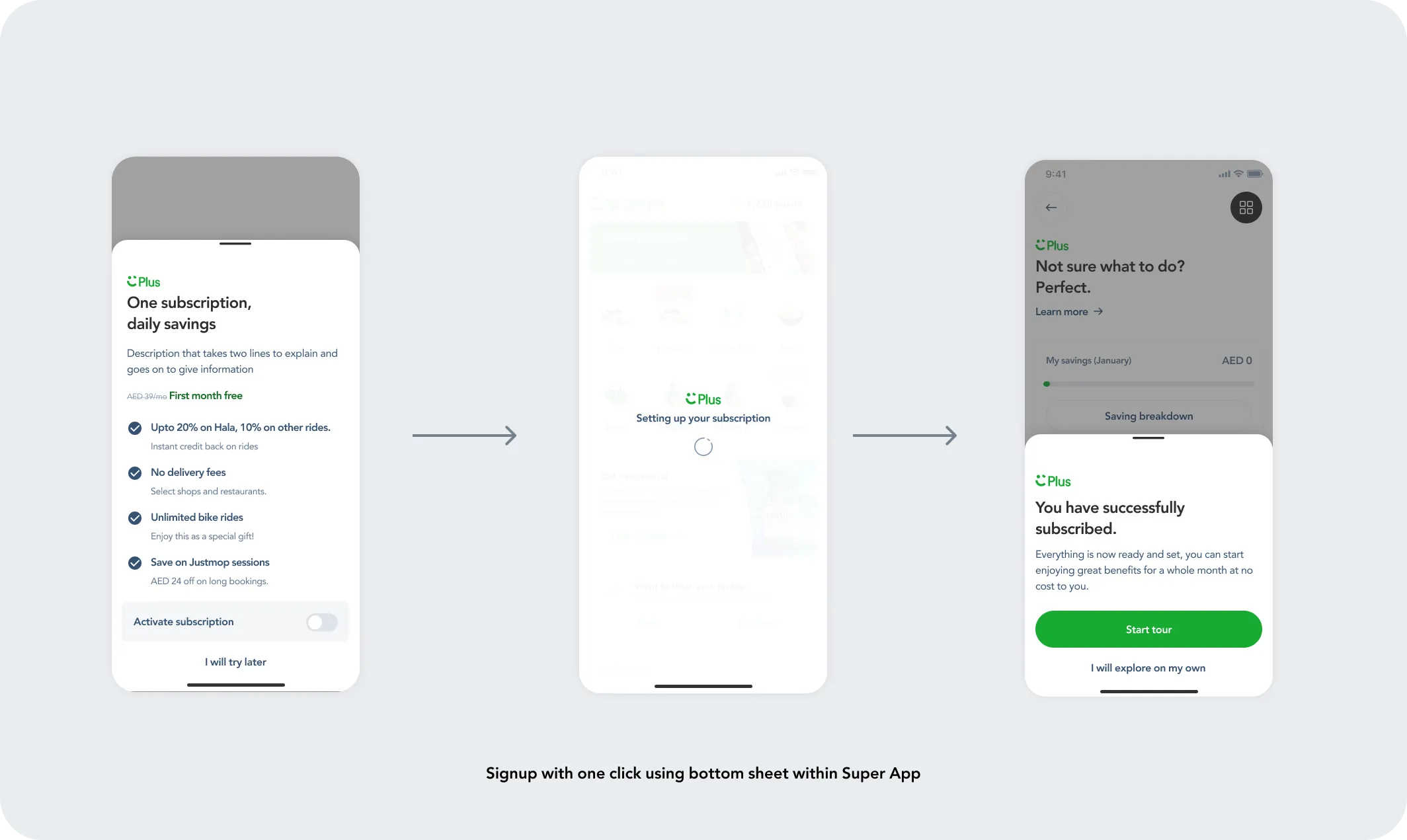
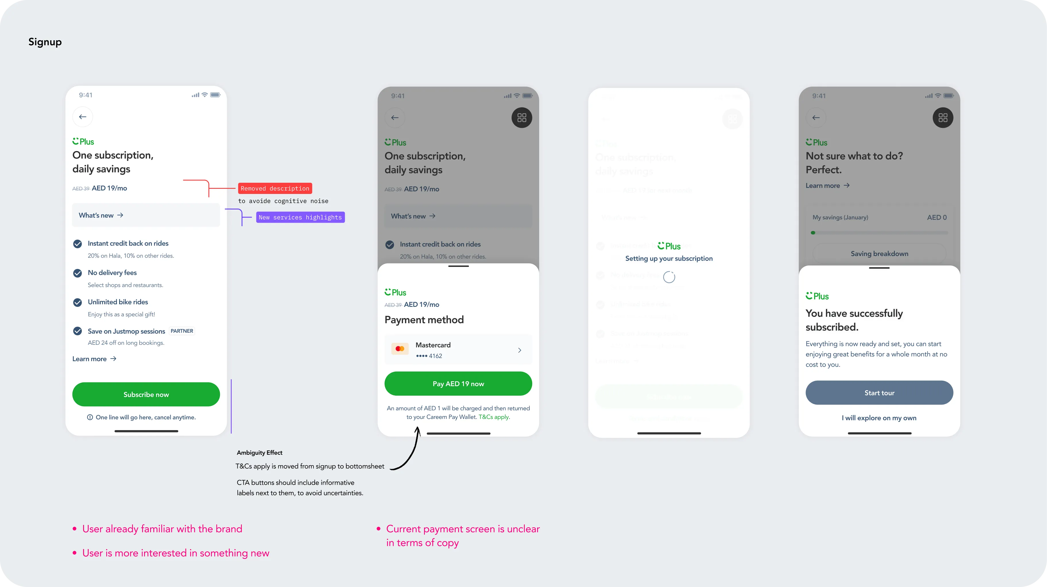
Make joining feel safe and fast
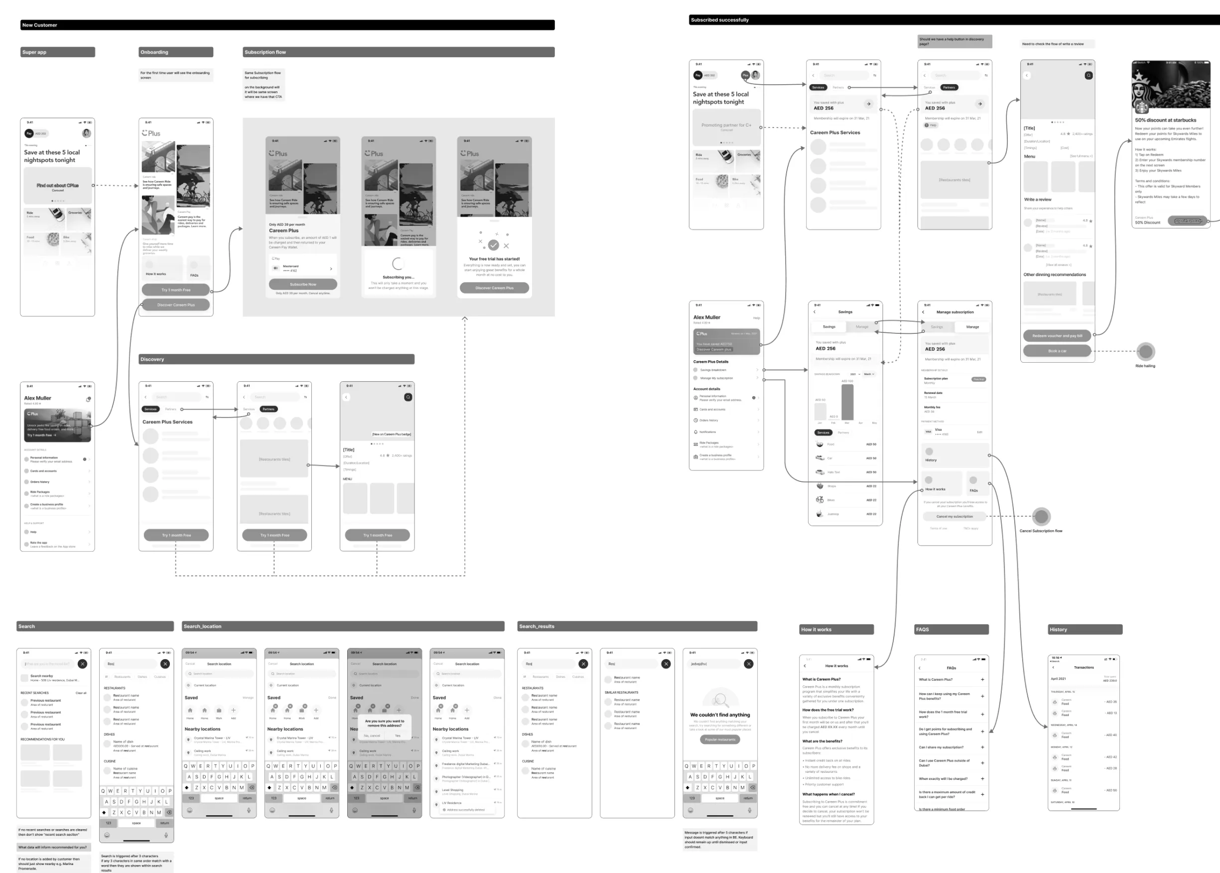
New customers needed a plain-language explanation and a low-risk first month. Existing customers needed speed. We explored both a one-tap activation and a payment bottom sheet, always showing the price and what would happen next.
2
Teach people in context
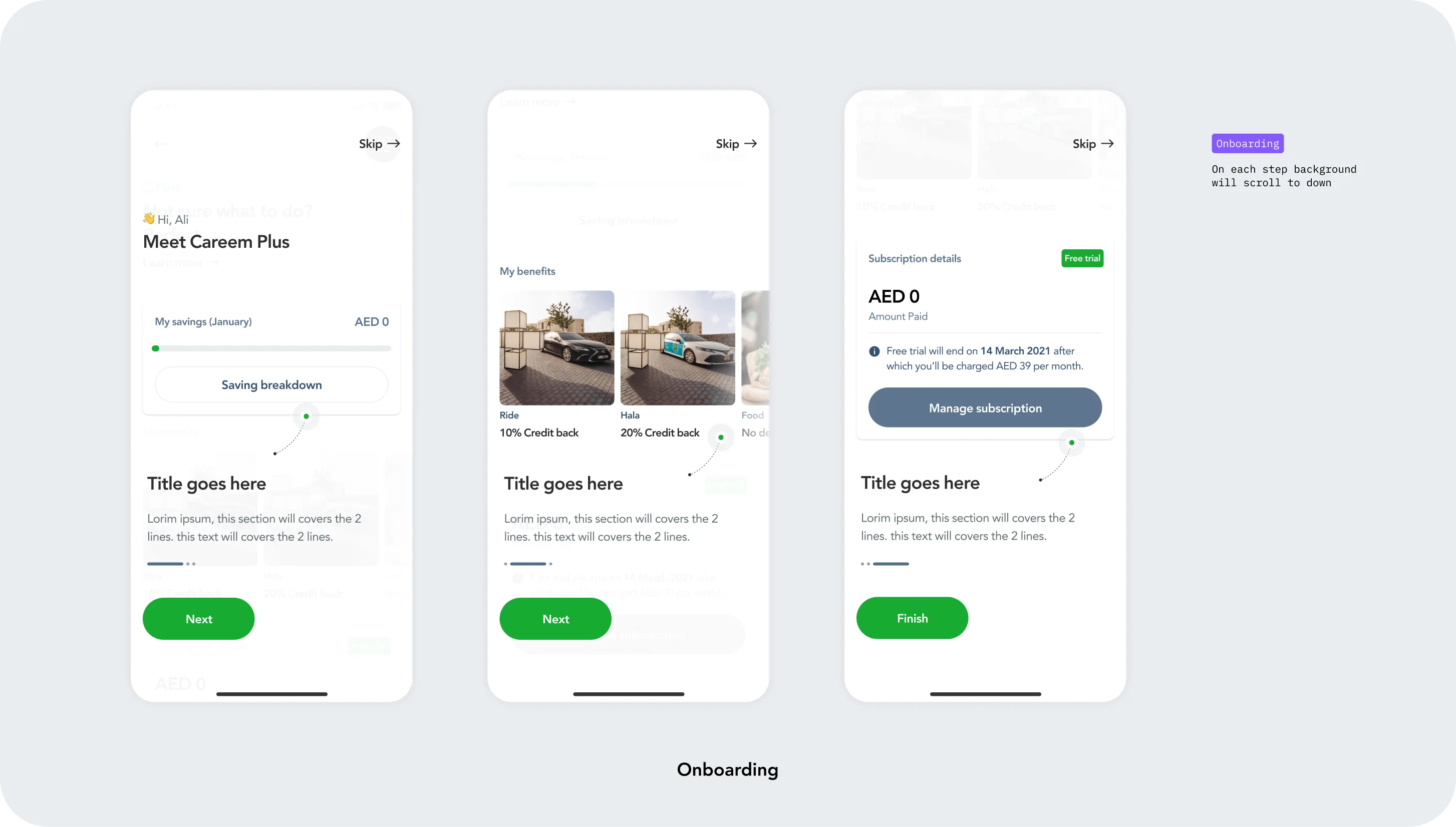
A short, skippable tour introduced savings, benefits and subscription management on top of the real home screen. It explained the product without forcing every member through the same lesson.
3
Turn savings into proof
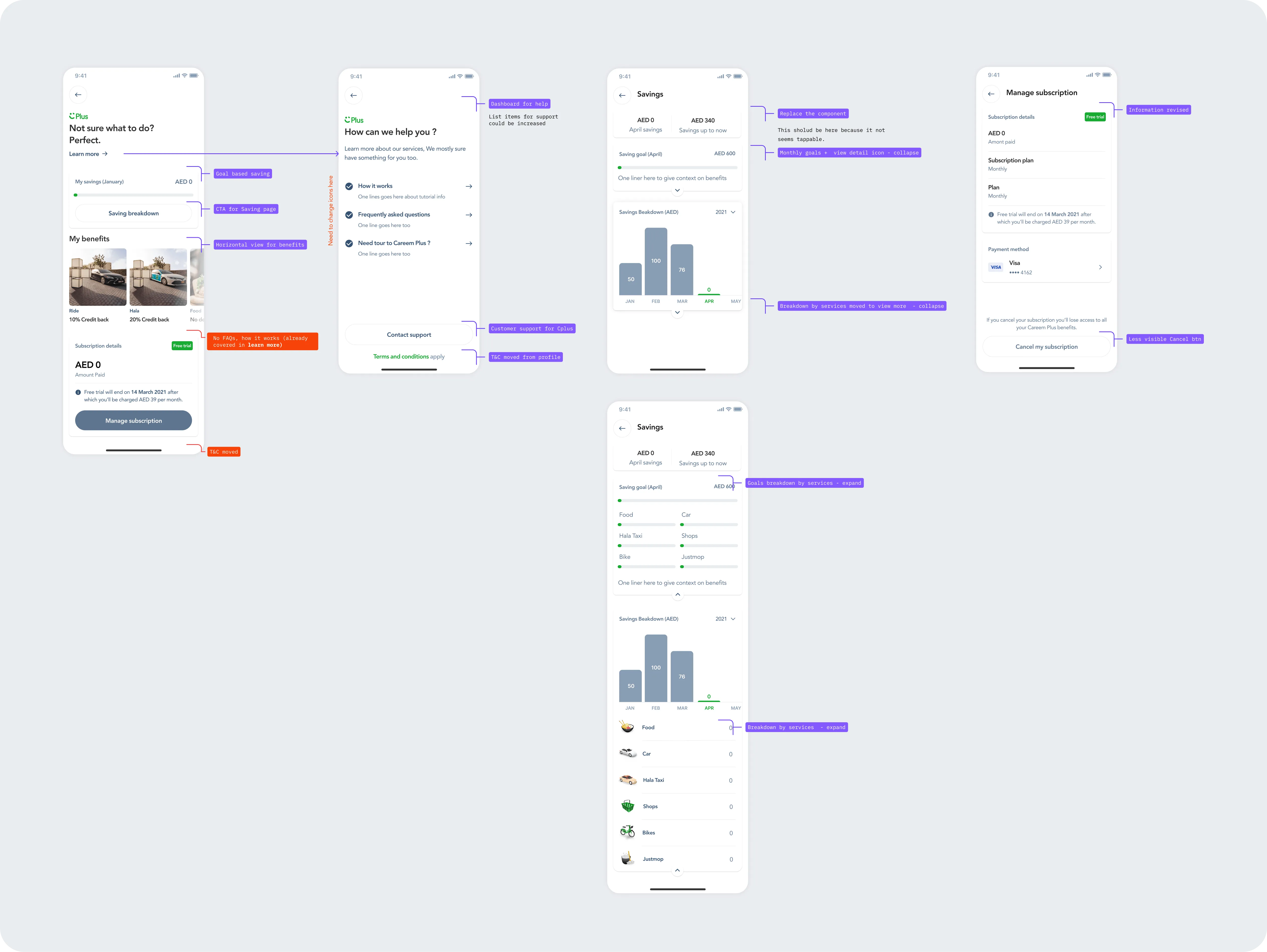
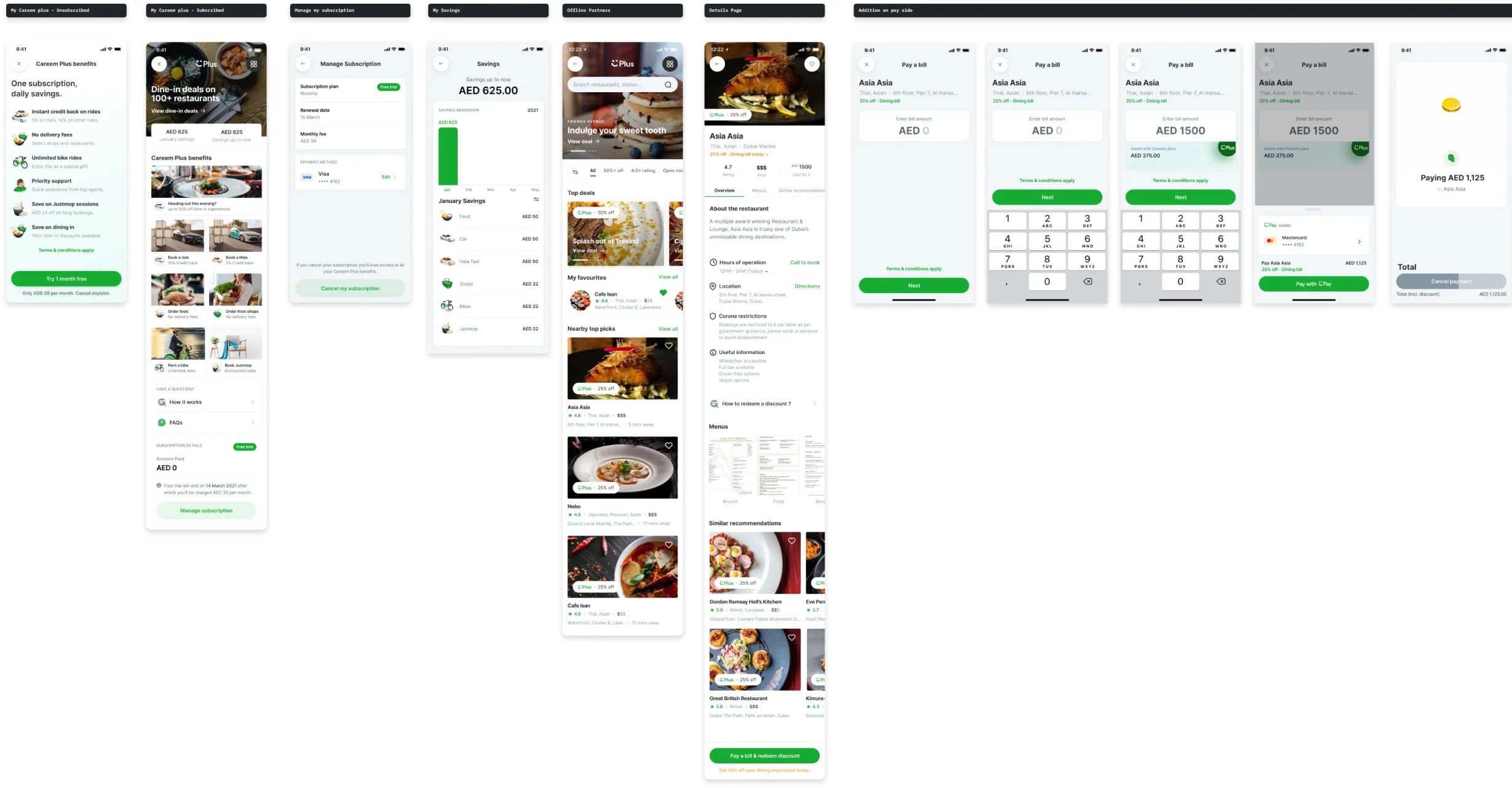
The home screen put monthly savings beside the benefits. A detailed view broke savings down by time and service, so value was visible rather than something Careem merely claimed.
4
Keep help and cancellation honest
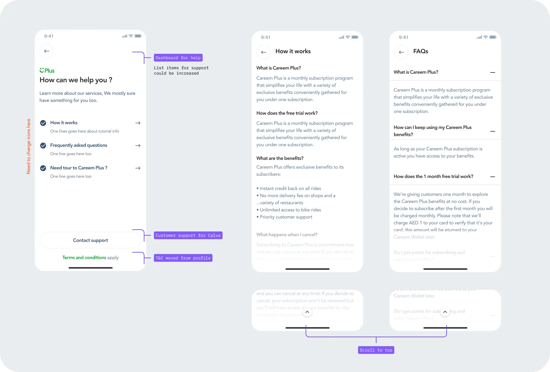
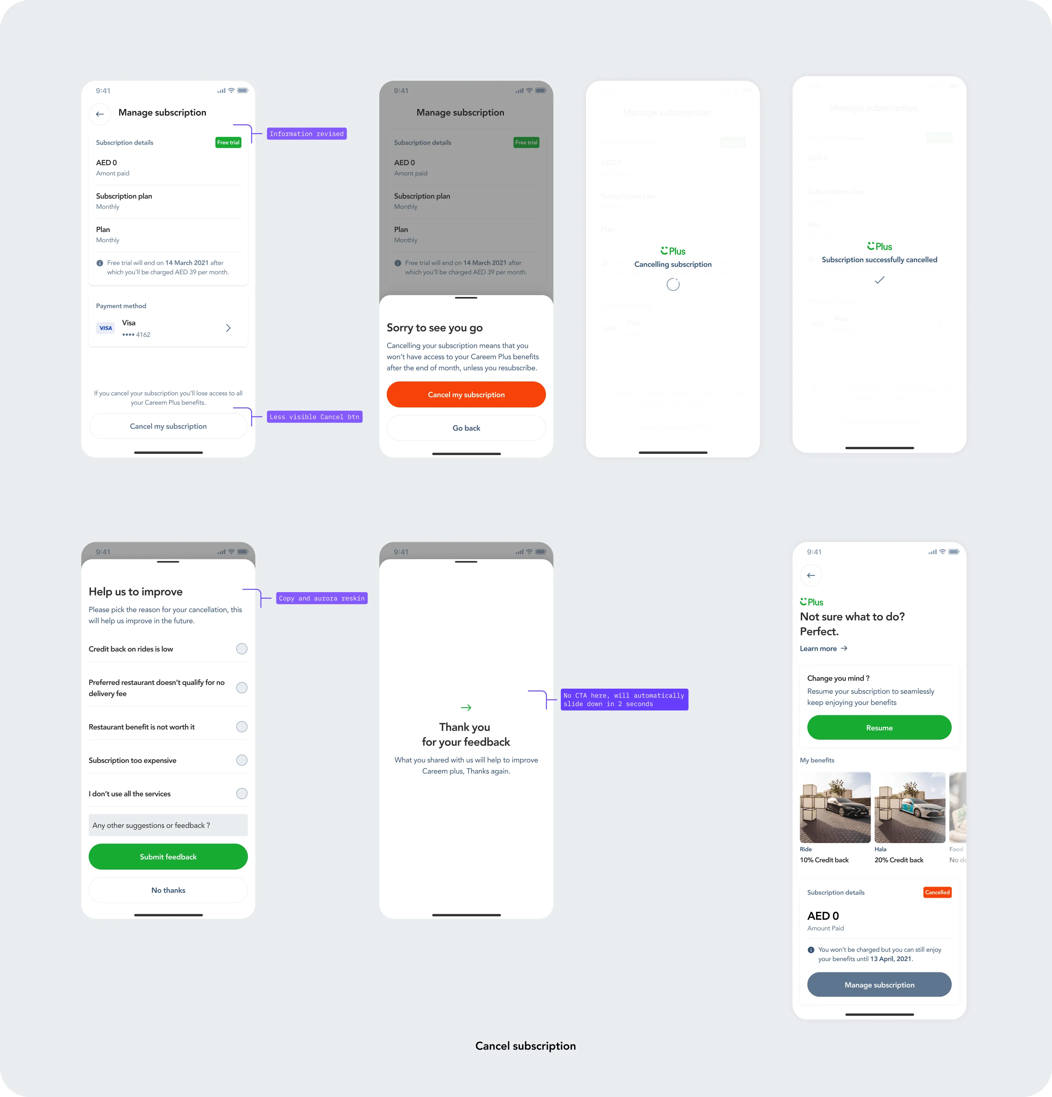
Members could reach FAQs, support and subscription details from one place. Cancellation included a clear consequence, an optional reason and a way to resume later. The business still had a chance to learn from churn without trapping the customer.
5
Show the benefit at the moment it matters
We added lightweight Plus messages inside food and ride journeys. Instead of relying on a separate marketing page, the product connected each benefit to the action a customer was already taking.
Launch gave us a clear signal
73%Second-month paid retention
50%Free-to-paid conversion
2.8%New-user acquisition
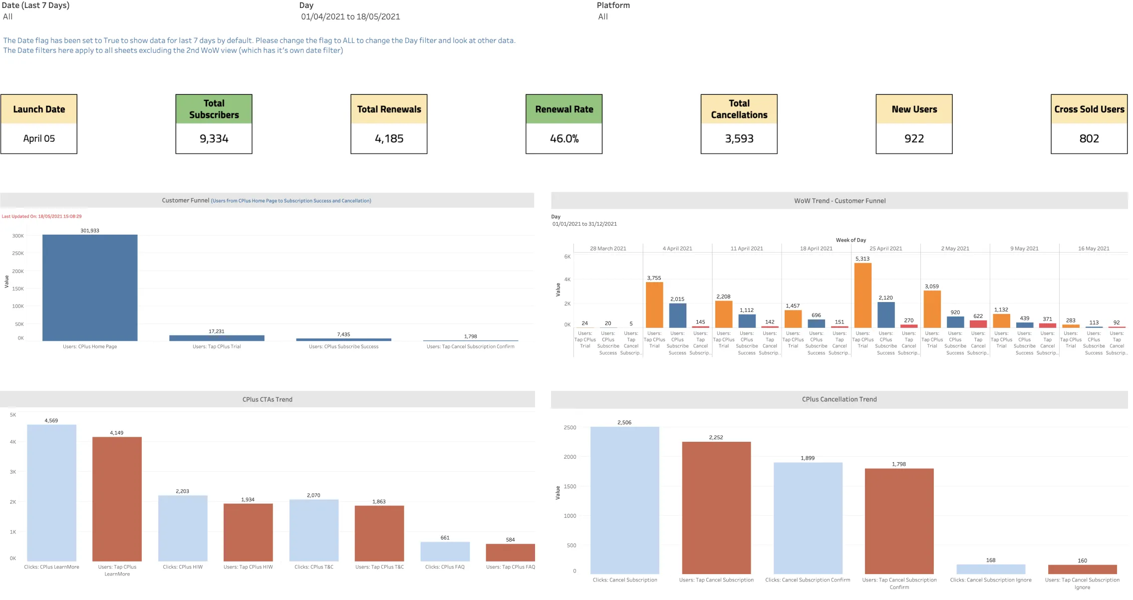
The strongest insight was not just that members stayed; it was why. Retention tracked with how much value people had actually used and could see. But new-user acquisition had plateaued at 2.8% against a 7% year-end target. Benefits limited to Careem services were valuable to existing customers, but they capped the programme's reach.
An early operating snapshot recorded 9,334 subscribers, 4,185 renewals and a 46% overall renewal rate. The 73% figure above refers to the later paid-to-paid cohort, so the two retention measures are not directly comparable.02
Extending the value
Taking Careem Plus beyond Careem
Using launch evidence to expand membership into everyday offline experiences.
The launch changed the question. We no longer needed to prove that a subscription could retain people; we needed to make it relevant to more of their lives. That led to offline partners: restaurants and venues where a member could discover an offer, visit in person, redeem it and see the saving beside their Careem activity.
How might we turn Careem Plus from a bundle of Careem discounts into a membership people value throughout their day?
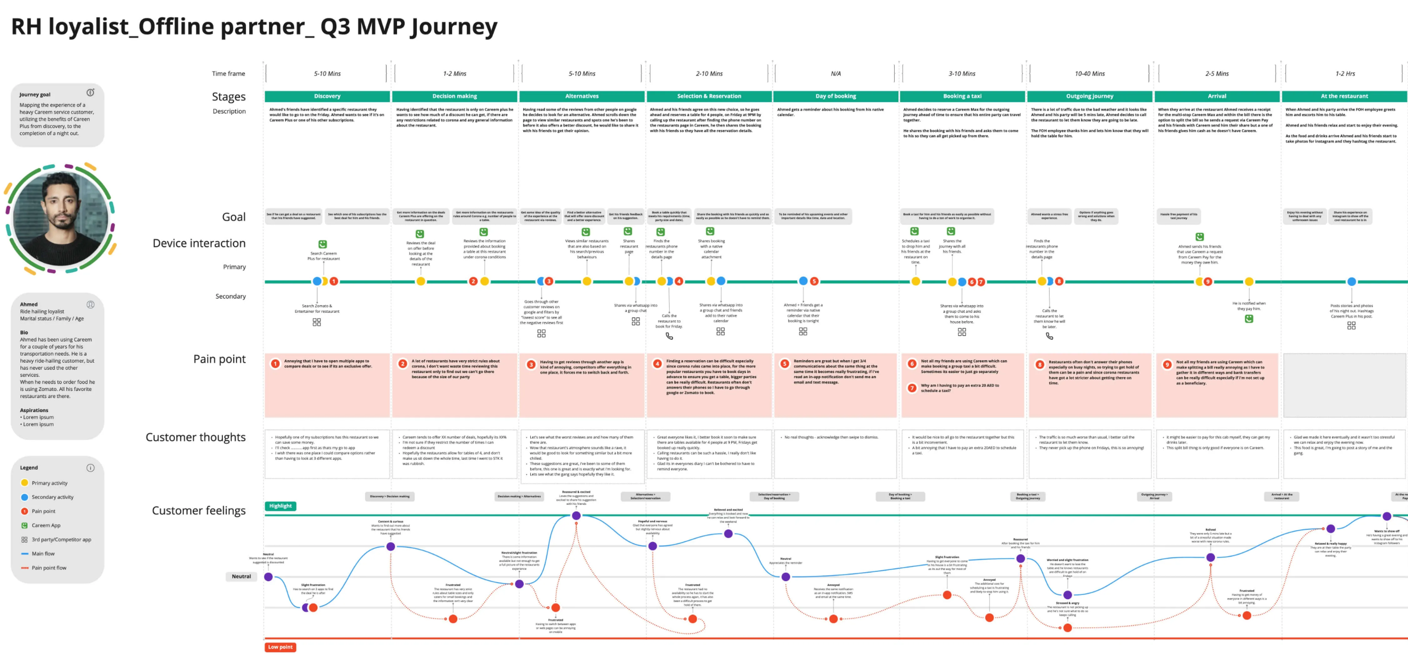
We mapped the real-world journey before drawing screens
A restaurant benefit does not end at discovery. It includes choosing a place, coordinating with friends, booking a ride, arriving, paying and knowing the discount worked. Mapping that whole journey exposed the moments where a digital promise could fail in the physical world.
Discover with confidence
Show useful partner details, availability, location and similar options.
Connect online and offline
Support directions, calling and a two-way ride without pretending Careem owned the venue.
Make redemption unmistakable
Apply the discount at payment and add the saving to the member's existing history.
Prioritisation turned the vision into a credible MVP
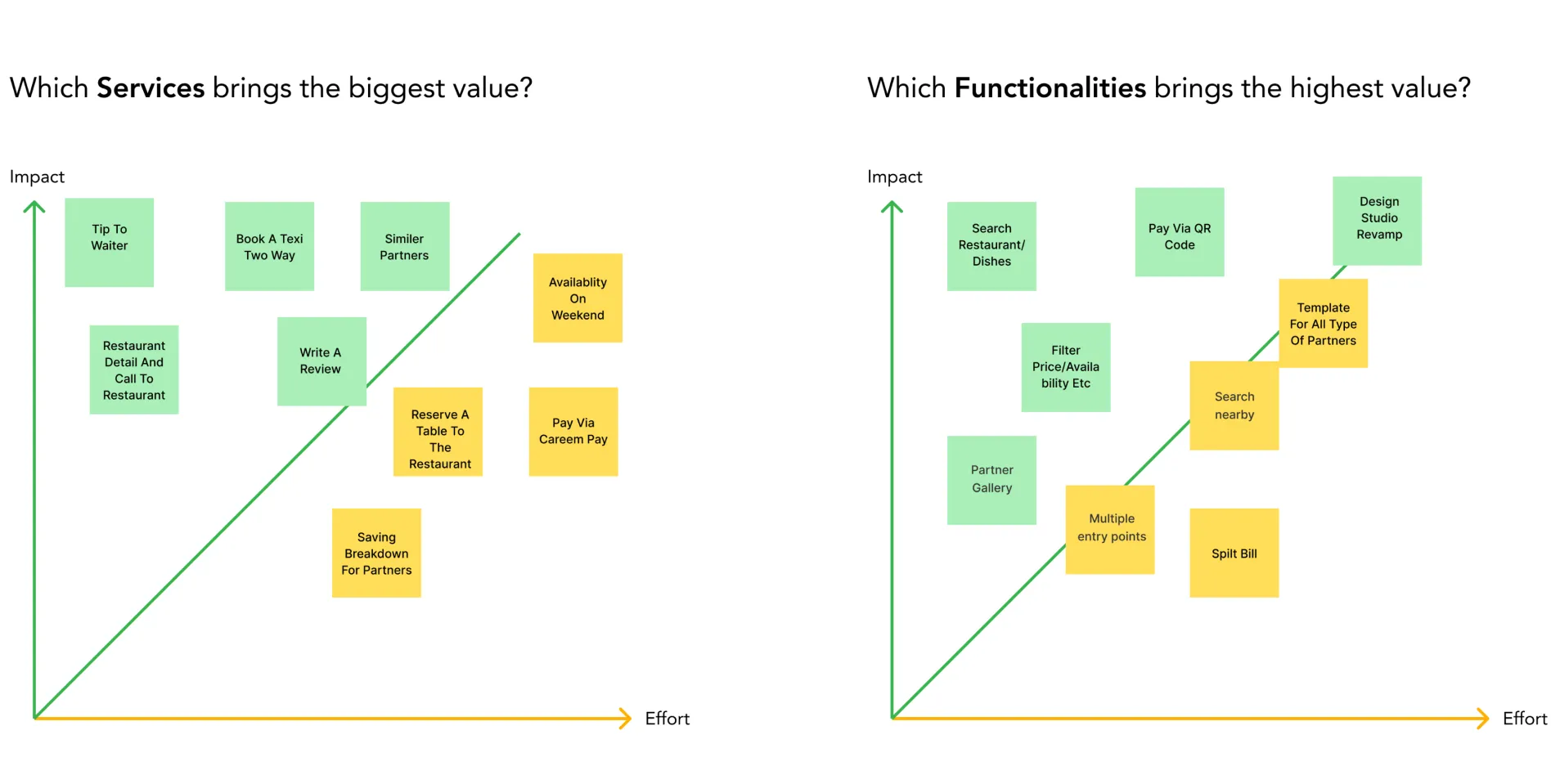
We compared customer impact with delivery effort. Partner discovery, restaurant details, direct contact, similar partners and the payment redemption path formed the core. Search, filters and QR payment were valuable, but more expensive. Table reservations were removed from this release because they conflicted with the existing food-booking experience and would have created a broken hand-off.
I translated the chosen scope into an end-to-end wireflow, including entry points, empty states, search, partner details, savings, subscription management and the redemption path. Cognitive walkthroughs helped us catch missing components and edge cases before detailed design.
One connected experience
The final direction kept offline benefits inside the product people already knew. A member could see dine-in value on the Plus home, browse participating partners, understand an offer, enter the bill amount and pay the discounted total with Careem Pay. Partner savings then returned to the same savings dashboard as rides, food and shops.
What the second chapter changed
A broader reason to join
Membership value was no longer limited by how often someone used a Careem-owned service.
A partner growth path
Retailers gained access to an engaged customer base, while Careem gained a path to partner-funded value.
One value story
Online and offline savings stayed visible in one place instead of becoming separate loyalty products.
The partner work produced a prioritised MVP and a delivery-ready product direction. I have not attached a post-launch partner metric because the material available for this case study does not support one. Keeping that distinction matters: the core subscription results are measured outcomes; the partner chapter shows the strategic response and the product capability we created next.
Reflection
What I carried forward
01
Show value; do not just promise it. Savings history became part of the product's retention loop.
02
Use business metrics as design input. Weak acquisition did not call for a prettier sign-up screen; it called for a broader proposition.
03
Scope is part of the experience. Removing a conflicting booking flow protected trust and gave the team a coherent MVP.
Careem Plus began as a way to connect services. It became a way to connect customer value, retention and partner growth. The shift from designing a subscription screen to shaping a membership business is the real story of the work.