Health and safety at workplace using Smartwatch.
This project is focused on designing the Fitbit watch app for a confidential company based in Silicon Valley. With major customers in UAE with operations across 10+ cities in UAE. 73% of UAE businesses/industries uses mobile app for supervising and managing employees. This case study is about, how might we use the smartwatch app in the workers, remote employees, and will discuss how companies can use this for employee's health and safety at the workplace.
Timeline
1 month
Role
Product designer
Responsibilities
Research, strategy, design
Problem statement
Health and safety at workplace and provide flexible way for daily activities at workplace
In UAE Summer is very hot and sunny, with temperatures ranging from 38 °C to 42 °C (101 °F to 108 °F) between May and September, as construction and industrial workers are not permitted to work during the hottest hours of the day during the summer because of Health and safety at the workplace. Our team come up with an idea to monitor workers/employee's heart rate using a smartwatch not just heart rate also daily office activities like approve or reject requests, and mark attendance, etc. As Fitbit Watch amplifies simplicity and eliminates the smallest little daily frictions. This device gives a great opportunity to streamline UX.
Target audience
- Workers (work in remote areas/factory) Age: 24-45
- Employees (often go to field) Age: 24-45
- Management
- HR person
- Leadership
Goals
User goals
- Health and safety Make people feel as their heart rate is being monitored and tracked, and get notified to the managers or family in case of emergency
- Provide flexible way for daily activities Help people to have flexibility on marking attendance, approve requests and get notifications etc using a smartwatch.
Business goals
- Increase the percentage of positive employee feedback from, 65% to 80%. Attainable: From 45% in 2019 to 80% in 2020. Relevant: To make the majority of the employees live the values of the organization.
- Ensure contact rate to customer support related to this module and overall app doesn't increase by XX% within 6 months of launching this feature.
Process
What we did
- Discovery to define user needs.
- Analysis to analyze all the gathered data.
- Ideation of sketches and functional prototypes.
- Test to improve design, accessibility and create a baseline for future product iterations.
Research
Though I audited other smartwatch apps, and most of them were focused on sports. To gain a competitive advantage, we choose the Fitbit watch due to its popularity amongst other watches. I look for available SDK for app implementation, Identify limits and capabilities of the hardware along with additional contexts such as cost and durability also help us to decide whether or not we should invest in building the app for Fitbit. Our goal was to leverage learnings from small devices and expand services across all devices.
Surveys
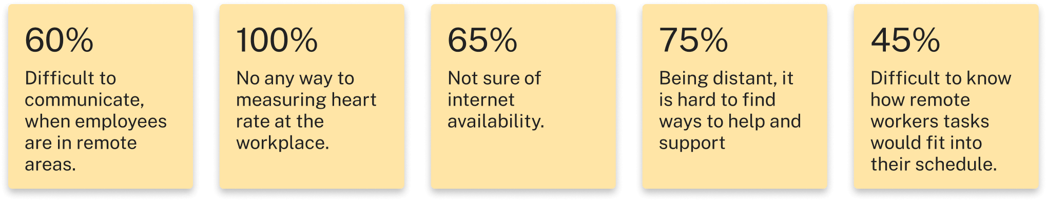
Customer Insights
We roll out surveys across different customer organizations and we received 10 responses we learned that primary how often do they work in remote areas? do they measure/monitor heart rate, blood pressure etc, at the workplace in a hot and sunny day, we noted down the results and pain points to test our hypothesis.
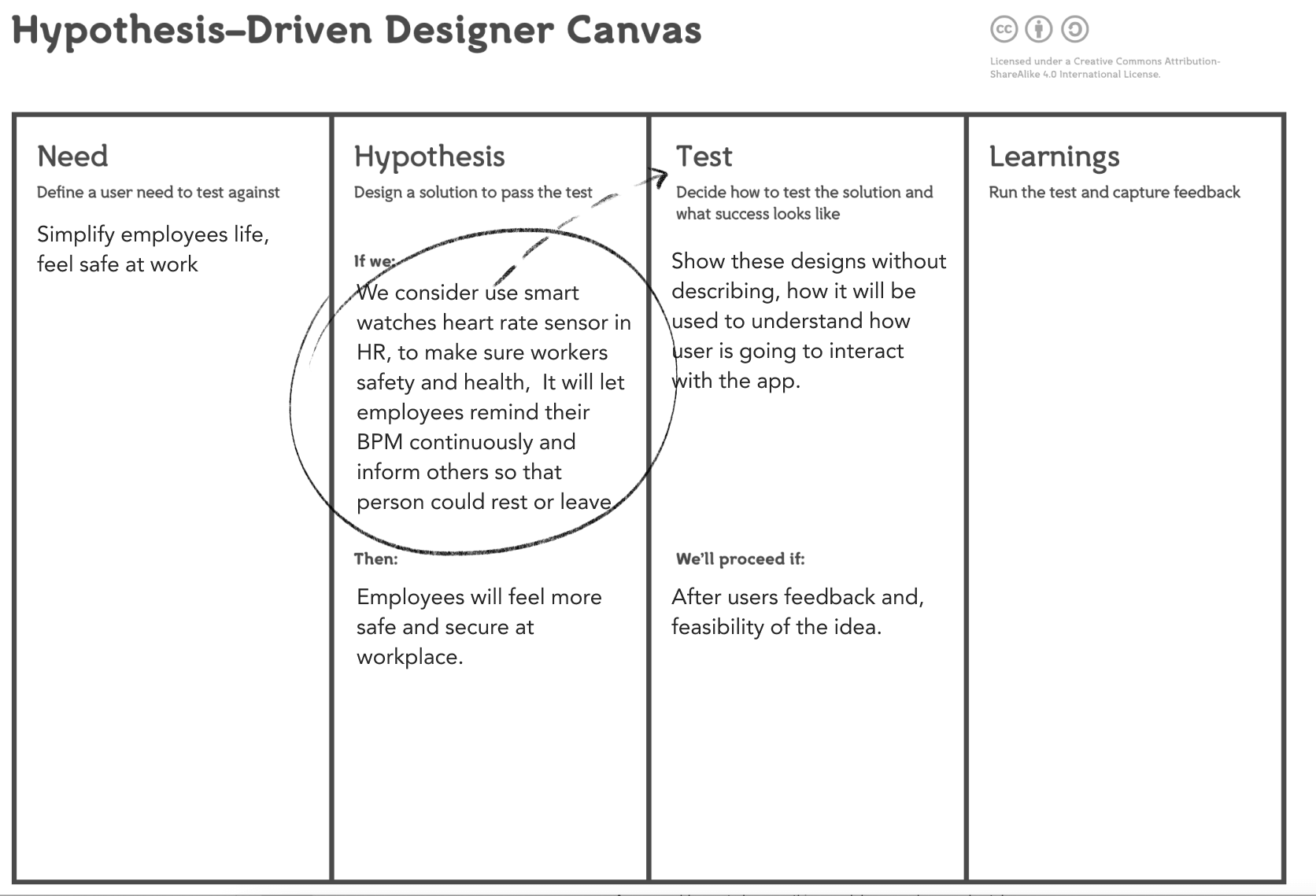
Hypothesis
We followed the hypothesis-driven designer canvas, which helps us to know instead of guess, It forces us to test whether our design hypotheses are true. To know if our solution is going to meet the needs of our target user. Also to know if it is going to make enough of an improvement to the user experience process to take it further.
Card sorting
We uncover user mental modal for better IA and to kick start from scratch.
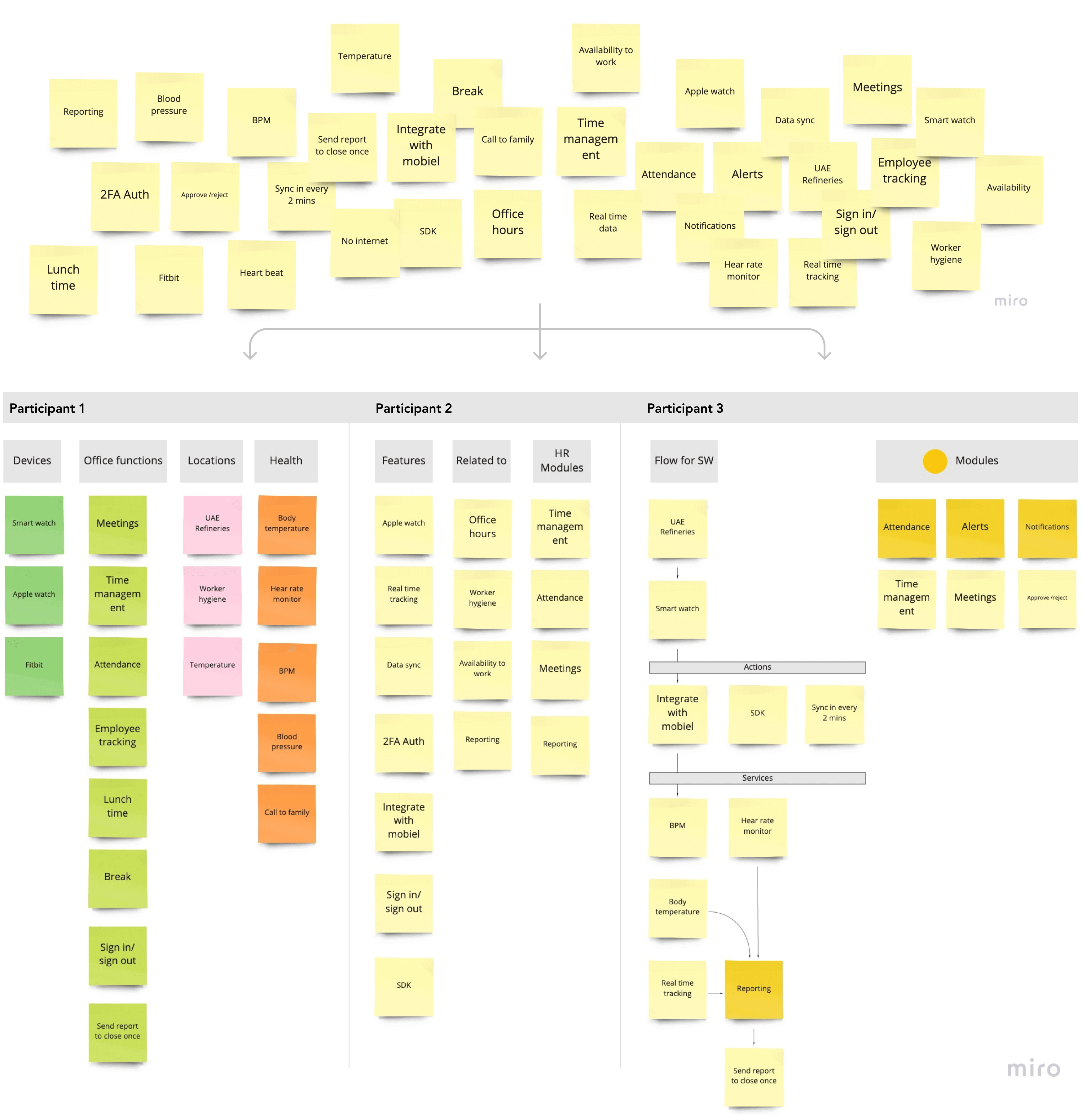
We did card sorting within an internal team to gain valuable information into the structure of data, that in turn helps us better structure our product for the long term. We followed the open card sorting technique, list all the information including services, features, modules, and general things which our users will find in the app.
I used miro for this exercise using the sticky notes, provide deck of cards to stakeholders with no pre-established groups and asked them to sort them in any way they see fit.
Also asked to explain why they choose that group: This is handy for initial data sorting exercise where no existing structure exists for platform in the product.
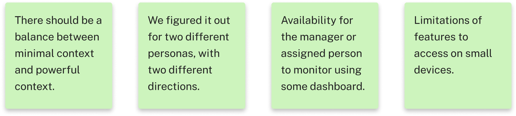
Ideal direction
Deciding that how we are going to approach the context, going with the minimal context or powerful context. as we also found several important insights through initial discovery and client interviews.
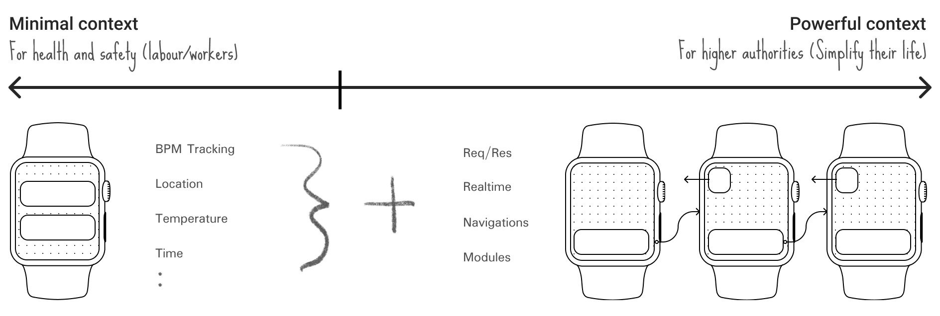
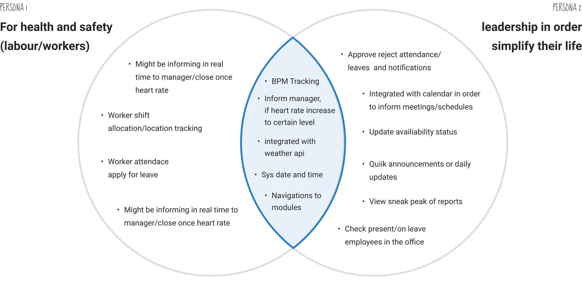
Ideation
I wanted to make sure we either design app more specific for health and safety or for the leadership in order simplify their life and after few meetings with stakeholders, I realize there was sufficient overlap to pursue a solution that would suit all users.
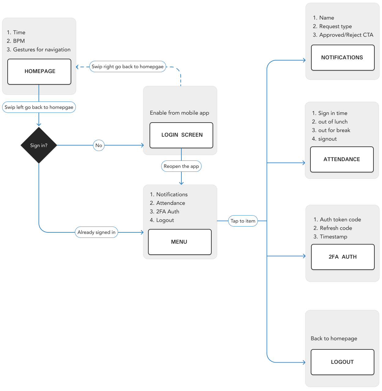
Userflow/sitemaps
I had gotten a fair understanding to start with user flows. User flow allowed me to see the complete app experience at a holistic level. Furthermore, Sitemap helped me make a checklist of all the pages to be designed.
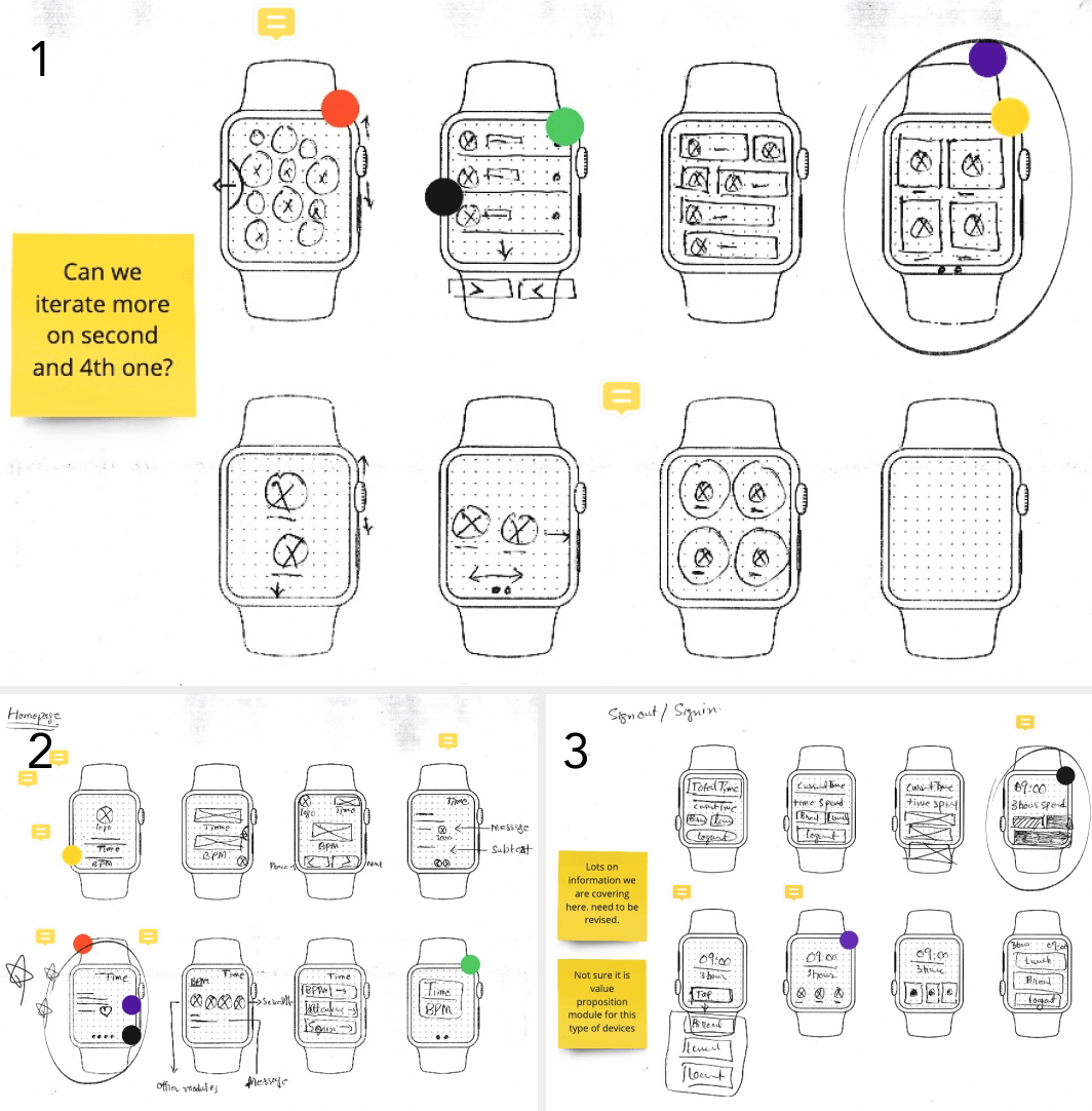
Crazy 8 exercise
Below are some iterations I made for all the top use cases, based on the understanding from all the previous exercises, This laid down the initial ideas. I explored how we might organize and categorize the content having multiple pages.
Wireframes
Wireframes were created to identify any missing components for screens. and how components gonna look like on the small devices so we could conduct cognitive walkthrough tests and reiterate on the design before moving into the high fidelity designs.
Iconography
The choice was quickly made as to what set of icons to use. For small devices, I choose filled icons and make sure no icon should appear heavier or lighter than any other of the same scale. also, avoid this by applying 2 pixels stroke in all of the icons. Designed on a pixel-based grid (24px by 24px) using foundational grid framework for icons, Also make precise adjustments to provide the perfect detail for the desired shape.
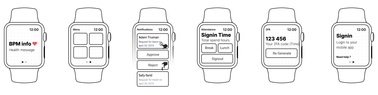
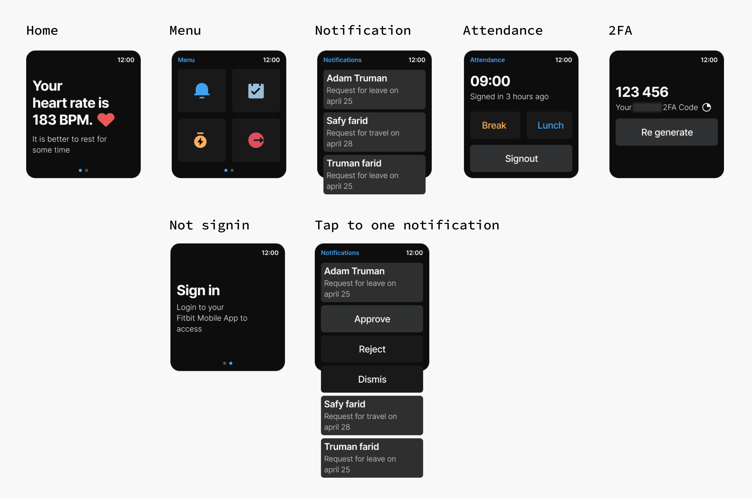
Key screens
The objective of the interface was to keep the app easy to use screen size and ratio. This was accomplished through the use of heavily rounded corners, vibrant gradients, big beautiful icons. In addition, I explore opportunities to give it a try to its front-end development with engineers. Fitbit SDK was completely based on the SVG based layout, so i also participated in the initial version of components similar to what we have designed.
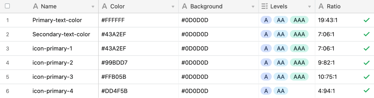
Accessibility
Accessibility has always been part of my process with a11y compliance or on the UI side. our color scheme needed a new pass to make it both simpler and compliant with the WCAG 2.0 rules for good contrast. We made sure that all our typography, as well as iconography, reaches at least AA level or 4.5:1 contrast ratio:
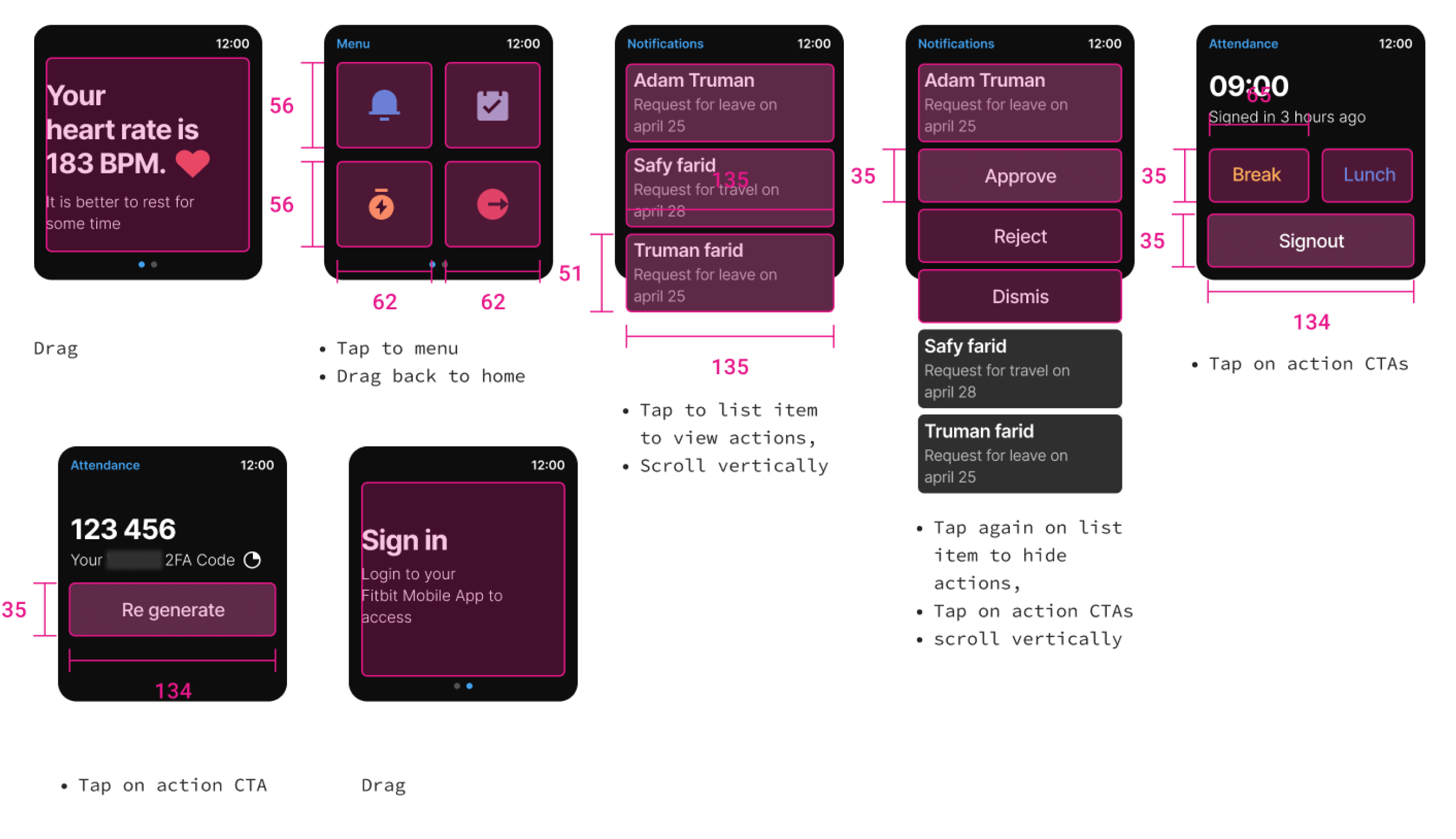
Touch targets and layout
We wanted to offer the user more space and touch targets while maintaining a compact layout for small devices, and aligning all touch type and with area to be the same size tremendously streamlined.
Prototype
Motion design
Good motion design on this form factor can make an app shine and empower its users to use it more effectively. But we also have to consider the limitations of the device so we only added a few micro interactions for click action and SVG icons.
This is what it looks like in the app:
Usability Testing
Several companies was gifted Fitbit watches to test the app in a real context. With the help of the customer support team, we scheduled 6 sessions to conduct a usability test. These sessions were conducted by the CS Team, while I was observing their behaviors and pain points and overall experience, then compiled findings using rainbow spreadsheets developed by Google UX Researcher. First, we started placing all the demographic information of the user into an excel sheet with different colors,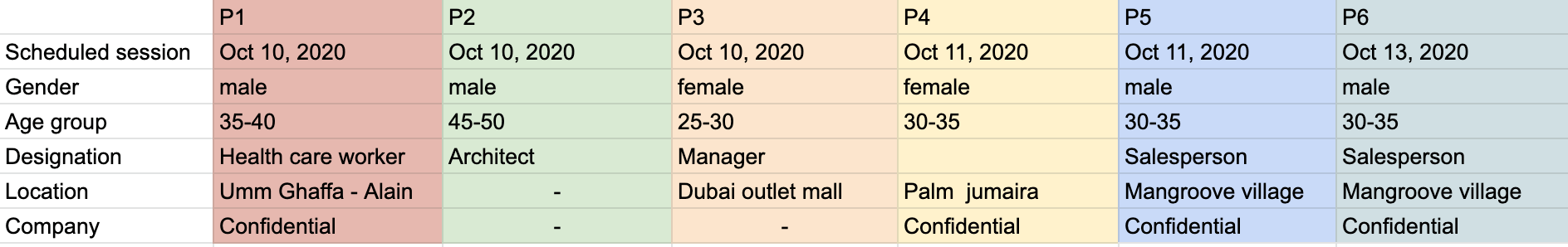 and then before conducting the study I wrote a list of predetermined observations to test. then I marked down if a particular observation occurred and prioritized all the observations for the next iteration.
and then before conducting the study I wrote a list of predetermined observations to test. then I marked down if a particular observation occurred and prioritized all the observations for the next iteration.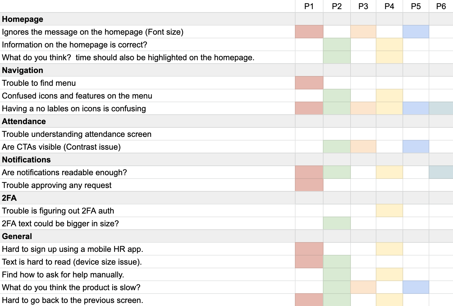
Learnings
Learned a lot in activity of 4 weeks two key lessons:
- We have analyzed results for milestone 1 and figured out that it isn't easy enough to implement experiences for very small devices. However, some components did not perform well due to SVG limitation, custom fonts not rendering properly and screen issues.
- Sometimes there's no need, and not always good, for how many journey maps you should create or to relay on time-consuming frameworks.
- Although I may not know all the business goals behind companies Fitbit watch app strategy, but learned that it is okay to make assumptions some time.