Introducing Offline partners into Careem plus
Careem is operational in 13 countries, and over 100+ cities. 48M+ users. On April, Careem introduced a new subscription program that offers benefits to its customers — named Careem Plus. Which simplifies the user's life with a variety of exclusive benefits conveniently gathered under one subscription. Initially be available to users in Dubai and coming soon to more cities!
Careem Plus program will cost a monthly fee of AED 39, and in return, users will get benefits like cashback on rides. Free food delivery on a variety of restaurants and shops. Unlimited access to Careem Bike and others. After the first month of a subscription, customers will be charged every month.
Careem Plus program will cost a monthly fee of AED 39, and in return, users will get benefits like cashback on rides. Free food delivery on a variety of restaurants and shops. Unlimited access to Careem Bike and others. After the first month of a subscription, customers will be charged every month.
Responsibilities
Research, strategy, design
Timeline
4 weeks
Contributors
Samuel rapp (Sr. product designer)
Syed Ali (Product designer)
Project plannig
This was the first time for me to apply the UX practices in a fully remote environment, so we started planning out with a few kickoff meetings. Understand the problem and break it down to be done in the respective project timeline.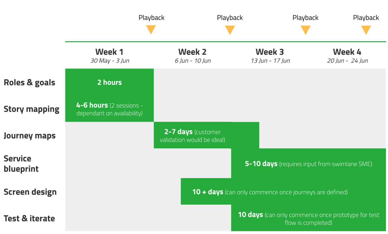
We also identified all stakeholders that are involved including other Teams/Tribes(i.e SA Team, Pay, etc).,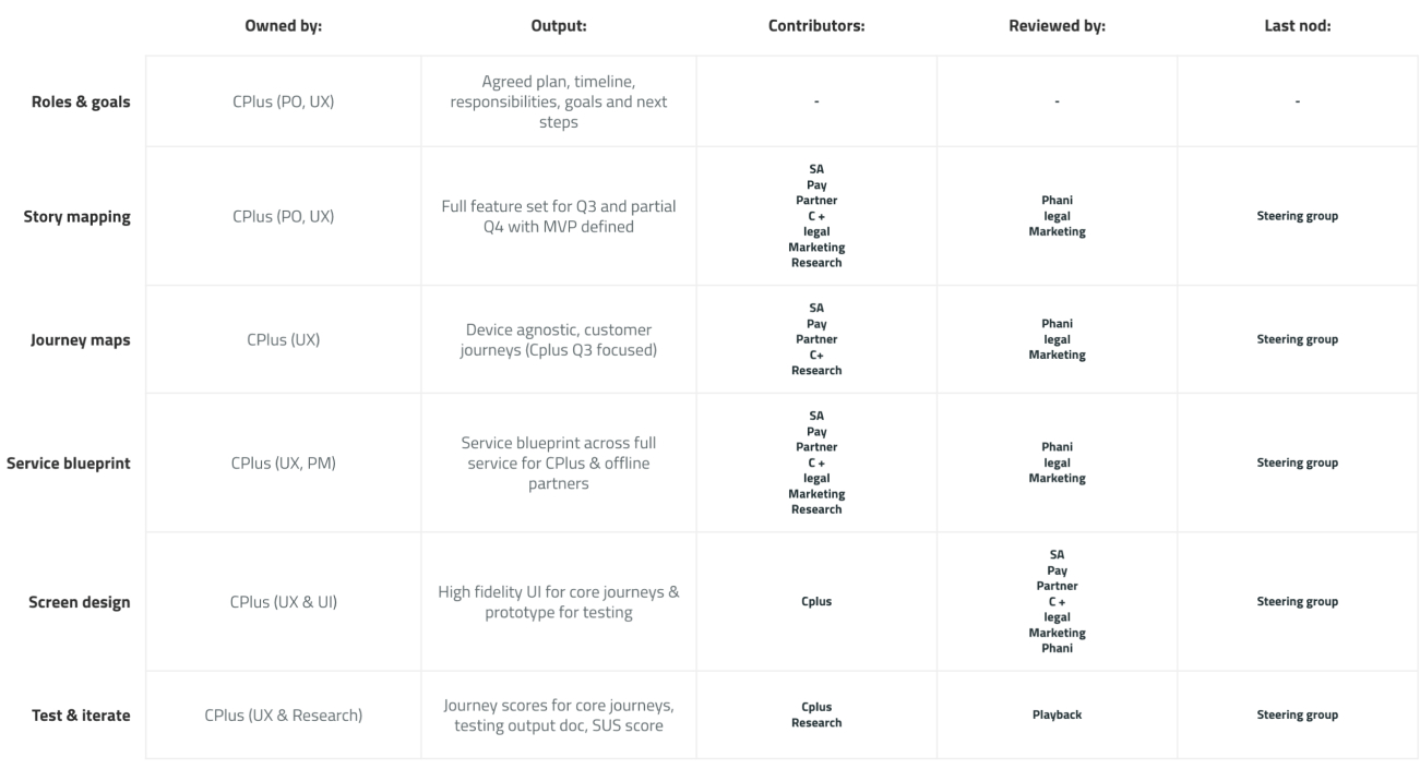

We also identified all stakeholders that are involved including other Teams/Tribes(i.e SA Team, Pay, etc).,

Problem
Careem aims to simplify the lives of 2M people every day by 2022. Research has shown that customers across the region value exclusive benefits in return for their loyalty. For the businesses, subscription model provides a steady, predictable stream of income, benefitting their cash flow. With the ongoing impact of the pandemic and accelerated digitization, we're likely to see the subscriptions economy continue to grow in Mena.
The existing version of the program is geared towards existing HV customers of Careem services, as we solve for more use cases, Careem further evolves the program by including partners and building a discovery engine, saving breakdown we need to rethink the whole experience of the program and also discover its true potential to evolve also attracts users outside the existing Careem ecosystem.
The existing version of the program is geared towards existing HV customers of Careem services, as we solve for more use cases, Careem further evolves the program by including partners and building a discovery engine, saving breakdown we need to rethink the whole experience of the program and also discover its true potential to evolve also attracts users outside the existing Careem ecosystem.
Goals
As this is a new product, we have very little data to benchmark against; however, we can start laying the groundwork to ensure that we meet our long-term goals.
Customer penetration
Increase the free trial penetration across active base to XX% within first 6 months of partners launch.
Increase the free trial penetration across active base to XX% within first 6 months of partners launch.
Customer retention
XX number of CPLUS memberships renewed beyond free membership within first 6 months of partners launch.
XX number of CPLUS memberships renewed beyond free membership within first 6 months of partners launch.
Customer support
Ensure contact rate to customer support related to Cplus and partners doesn't increase by XX% within 6 months of partner launch.
Ensure contact rate to customer support related to Cplus and partners doesn't increase by XX% within 6 months of partner launch.
Customer experience
Implement NPS rating for Cplus journey to create a benchmark for Q4.
Implement NPS rating for Cplus journey to create a benchmark for Q4.
Customer transactions
Increase the number of transactions completed by CPlus subscribed customers by xx% within first 6 months of partners launch
Increase the number of transactions completed by CPlus subscribed customers by xx% within first 6 months of partners launch
Partner alignment
Of the 15 offline partners that are initially approached 90% accept our redemption solution, by end of first week of July.
Of the 15 offline partners that are initially approached 90% accept our redemption solution, by end of first week of July.
Process
What we did?

Research
We performed foundational user research to understand more about the personas that are the target audience of the Careem app. Understand customers perception in terms of discount and lifestyle applications within the U.A.E and test our hypothesis for customer journeys and user interface flows.
→ Onboarding to a subscription plan for Careem Plus
→ Discovery of an offer
→ Fulfillment of an offer
→ Review of experience
Results from this research will help refine our understanding of customer expectations from a journey perspective, giving us direct feedback to either confirm or change our hypothetical customer journeys. User testing of UI will give us insights on specific screen elements as well as the customer's perception of the entire user flow.
Who are our customers?
Understanding different target groups

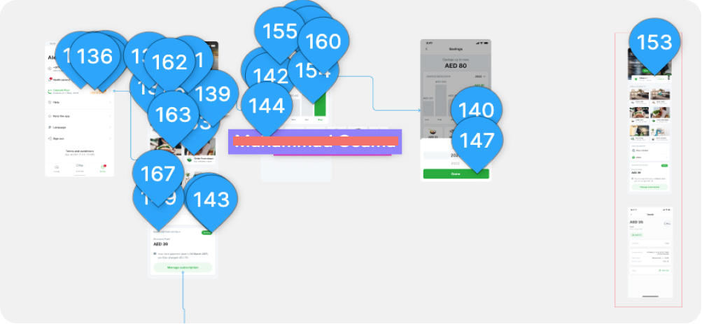
Design crit
Before rethinking the experience, we had to keep MVP and Q2 things in the mind to have a continuity in overall design, also make sure to improve some areas. We had to look into the design critique session feedback by design team and rethink on each feedback and improve the overall experience.
Objective: To have a clear understanding of all the loopholes in terms on user experience and an edge cases to be taken care of during Q3 phase.
Insights:
Objective: To have a clear understanding of all the loopholes in terms on user experience and an edge cases to be taken care of during Q3 phase.
Insights:
- Banner pictures for the profile page would have to be chosen very carefully. Even this one is conflicting with the text and the CTA is also hiding some details.
- Are saving chart bars are tappable?
- How will the user learn that these are tappable?
- The saving breakdown doesn't seems connected with the relevant graph.
- Where we are showing “CPlus is activated” on booking a ride screen that place to show PEAK in Careem might confuse customers.
- Copy improvement
Competitors analysis
We analyzed the major direct and indirect products and subscription providers, looking into opportunity spaces where our feature for the Careem Plus app can fill the gaps. We gathered data on competitive products and noted their UI, UX, User flow, and key features.
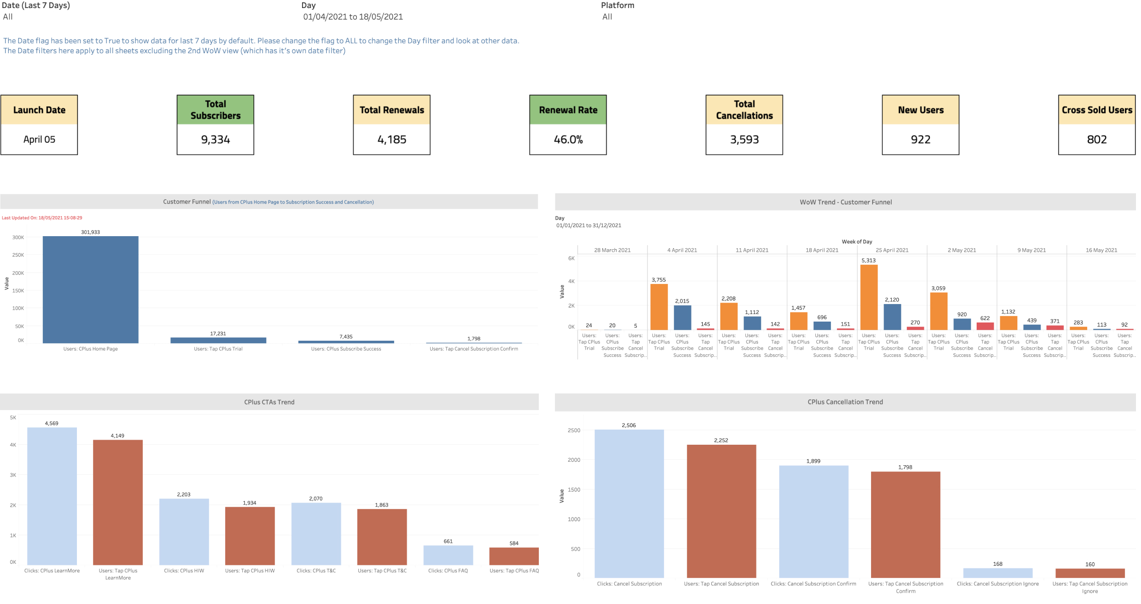
Existing matrics
Vision brainstorming
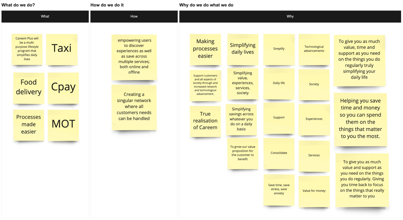
At its full potential, Careem Plus will be a multi-purpose lifestyle program that simplifies daily lives; simplifying daily lives by empowering users to discover experiences as well as save across multiple services; both online and offline.
Careem’s partners will also be fully empowered to grow their business in partnership with us. Any eligible partner will have the opportunity to target the largest tech-savvy base that's highly engaged across multiple services. As Careem realizes its super app vision, we would have access to detailed information about users which will be leveraged to help partners target the right user at the right time. Just by 2022, Careem will have detailed knowledge of where a user lives, works, eats, orders groceries from, spending power, and even the size of their house; and this is just the surface of what information Careem will be equipped with.
For Careem, CPlus helps realize the super app vision. It'll act as a catalyst to convert users to MSU’s; one platform to promote any new service we launch and benefit from instant adoption. It will also become a new business line that not only funds discounts on Careem owned services but also generates additional revenue.
Proto personas
Then we got some user personas from the marketing team that embodies the traits of the target audience to understand the kind of audience with different use cases who uses the Careem app.

Story mapping
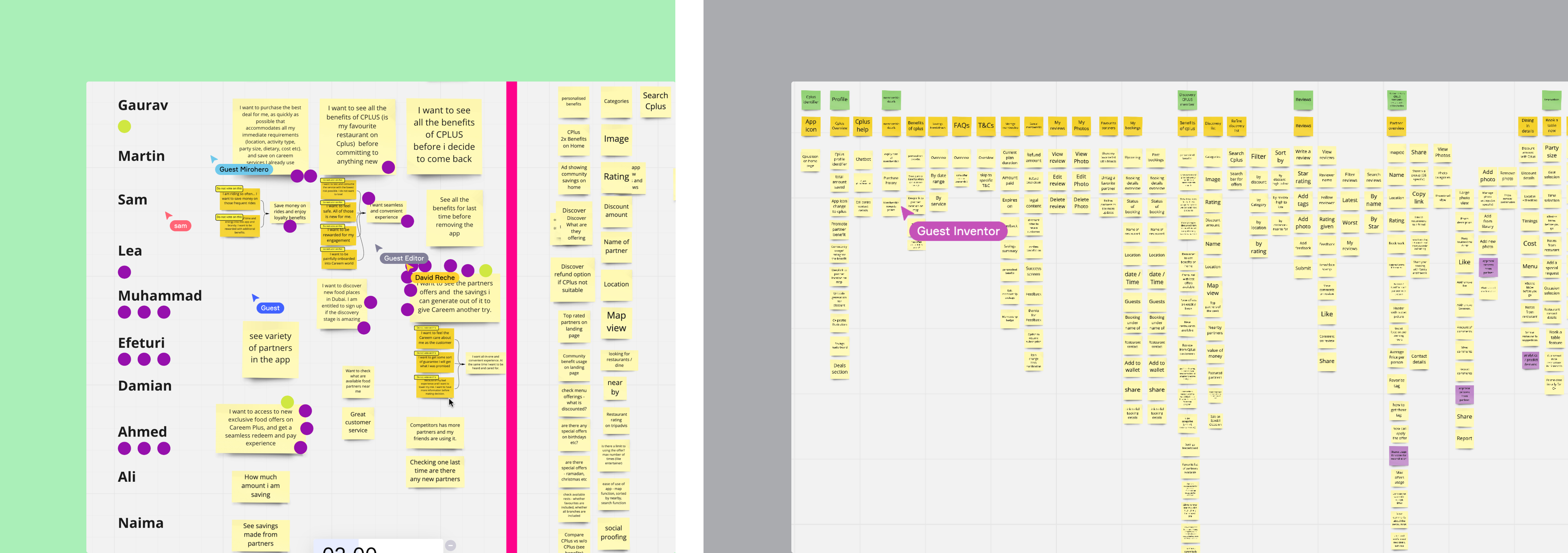
Brainstorming: In collaboration with a group of designers, PM, Engineers, partners team, and other domain experts, we list all the things our customer will need to do to complete a booking with one of our offline partners, from finding the partner, to visiting the partner's venue until to when they've returned home and left a review.
We use Miro board for this exercise using the sticky notes, write down all the things our customers would do. 1 task per sticky note.
Organize: Layout your stickies from left to right, from start to finish, in the order that our customer will perform each task.
Slicing the MVP: As a group, we silently move tasks that we don’t think are essential to our customer's desired outcomes and our business goals to the bottom. Now that we have our MVP, we can start to slice the remaining features. Don’t forget “must do, could do” this will help us prioritize our stickies.
We use Miro board for this exercise using the sticky notes, write down all the things our customers would do. 1 task per sticky note.
Organize: Layout your stickies from left to right, from start to finish, in the order that our customer will perform each task.
- Group similar tasks into columns.
- Arrange duplicate, sticky into stack or remove
- Put smaller tasks under the larger tasks, for example, “Filter restaurants” or “sorting restaurants list” might go under “Filtering partners”
Slicing the MVP: As a group, we silently move tasks that we don’t think are essential to our customer's desired outcomes and our business goals to the bottom. Now that we have our MVP, we can start to slice the remaining features. Don’t forget “must do, could do” this will help us prioritize our stickies.
Action/Impact Analysis
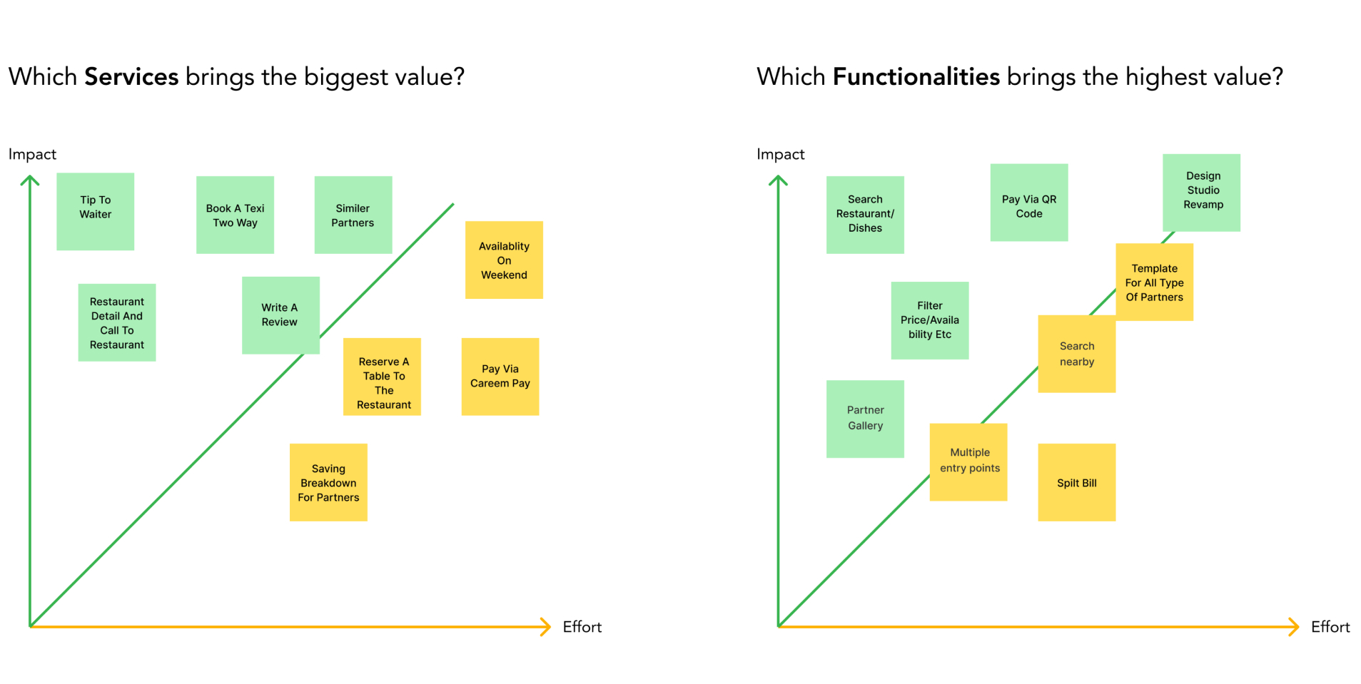
From there, we plotted each of these features/services on a Impact/Effort Matrix to gauge the features/services that were most pertinent and viable for both user value and organization efforts.
Insights: The key services to focus on is Booking a taxi two-way and restaurant details write a review and similar partners while functionalities like search/filters pay via QR code and onboarding for new signups.
Insights: The key services to focus on is Booking a taxi two-way and restaurant details write a review and similar partners while functionalities like search/filters pay via QR code and onboarding for new signups.
User Journey
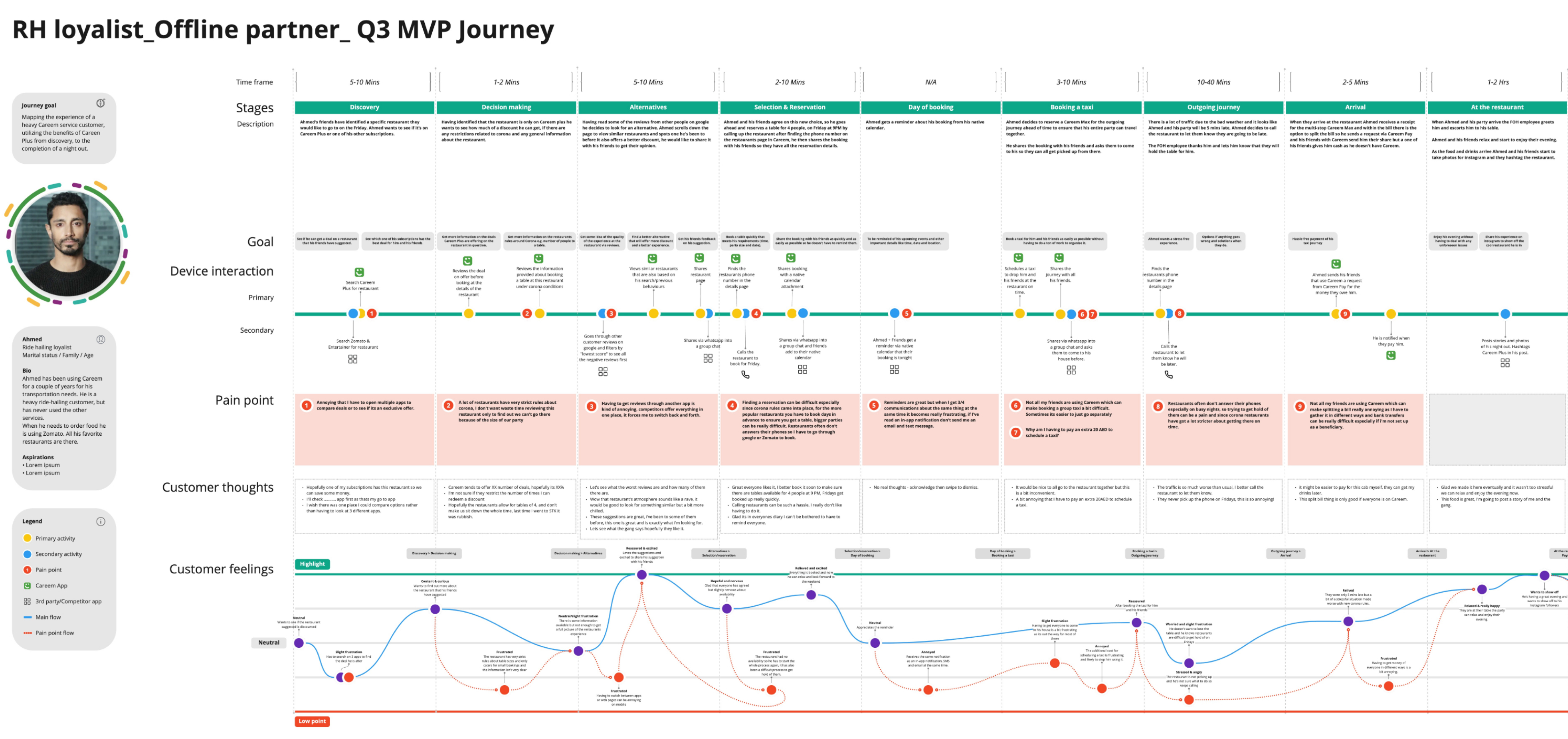
Objective: Outline key journey points, highlighting potential pain points and opportunities to improve the customer's experience with Careem Plus.
Who needs to attend: Designers & PO/PMs to create and then playback with a vertical and separate session with key stakeholders including customer playback.
Output: Customer journeys for key use cases.
Who needs to attend: Designers & PO/PMs to create and then playback with a vertical and separate session with key stakeholders including customer playback.
Output: Customer journeys for key use cases.
User Flow / Sitemaps
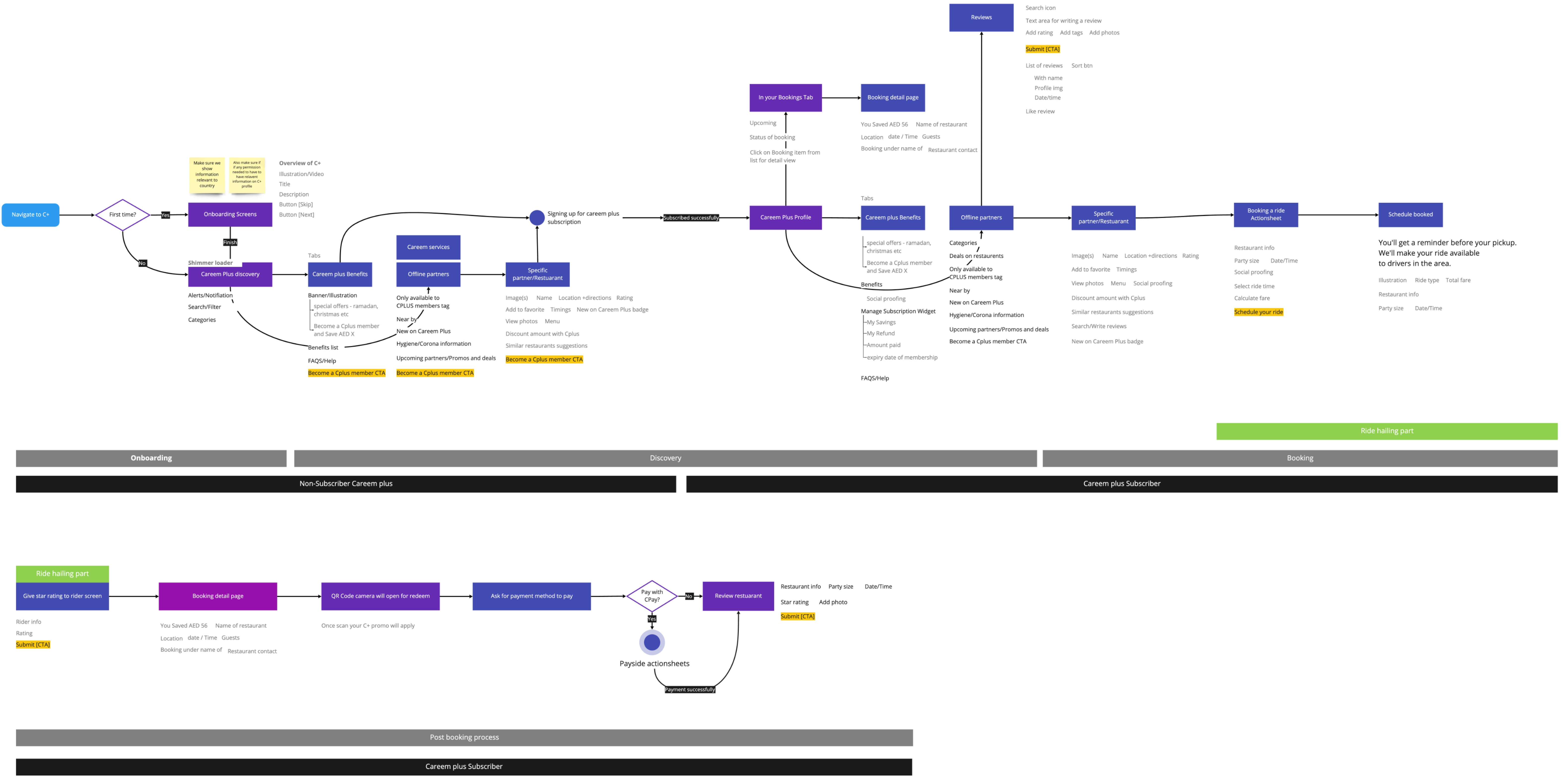
After exploratory and market research, I had gotten a fair understanding of the primary user flows for Careem plus upcoming features and improvements.
Insights: User flow allowed me to see the complete app experience at a holistic level. Furthermore, this sitemap helped me make a checklist of all the pages to be designed and taxonomies involve the classification, categorization, and organization of information on each screen.
Insights: User flow allowed me to see the complete app experience at a holistic level. Furthermore, this sitemap helped me make a checklist of all the pages to be designed and taxonomies involve the classification, categorization, and organization of information on each screen.
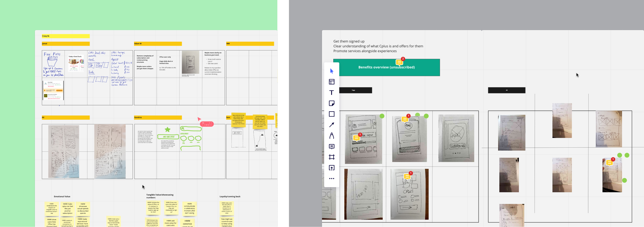
Crazy 8's
Based on the hypothesis, We did multiple iterations of crazy-8's for all the top use cases. This laid down the initial ideas for the app in a very small amount of time. But at the same time we ensured there aren’t any biases. These designs were subject to pivot/change based on the formative and competitive research.
Insights: We wanted to come up with a discovery page which includes the list of restaurants and discounts and detail pages; this laid down the foundation of how this screen will look like.
Insights: We wanted to come up with a discovery page which includes the list of restaurants and discounts and detail pages; this laid down the foundation of how this screen will look like.
Wireflows
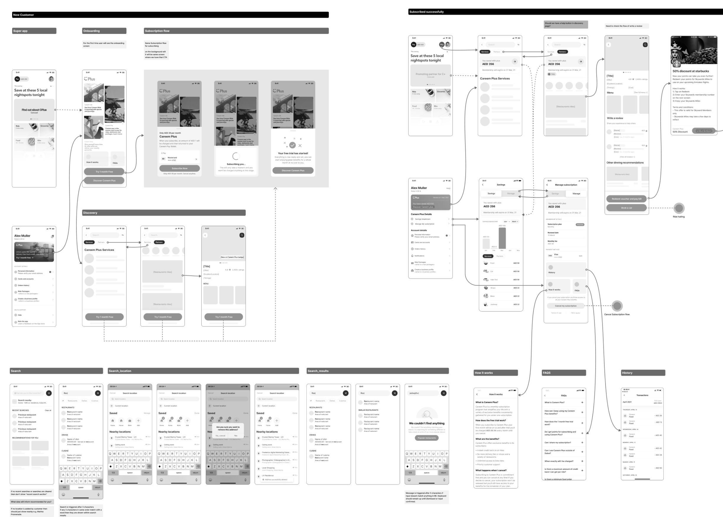
To begin, wireframes with flows were created to identify any missing components for screens. These screens were created digitally and prototyped to conduct cognitive walkthrough tests and to reiterate the design before moving onto high fidelity mockups.
Key screens
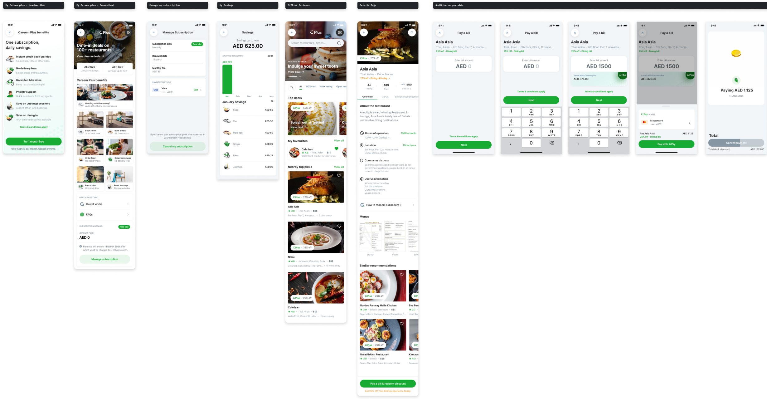
We designed key screens for Careem plus user that provides users with the ability to discover restaurants and avail discounts on different offline partners with saving costs as well as providing the flexibility to explore and understand the program in a better way.
Insights: After iterating and feedback, we come to identify key screens and the flow for Q3, some of the features get de-scoped from Q3 because of limited resources like (I.e onboarding to Careem plus)
Insights: After iterating and feedback, we come to identify key screens and the flow for Q3, some of the features get de-scoped from Q3 because of limited resources like (I.e onboarding to Careem plus)
Conflicts
Based on the feedback from different stakeholders, including SA Team, Food Team, PMS, we are having a conflict between food delivery and booking a table process, our users will able to experience a problem. the team decided to de-scope this feature and delay for next year's launch.
Learnings
This was the first time for me to follow the UX Process in a fully remote environment, so I learned a lot in terms of collaboration and working quickly through frameworks. Communicating without being in person was also different, but I learned how to communicate asynchronously and also collaboratively.
The challenge focused heavily on building a feature to introduce a new direction in the subscription module inside the existing Super app, and this was something all of us had never attempted before in a product.
I also got the chance to explore work done by a design agency called Design Studio, as we had to look forward to in terms of overall Careem’s design guidelines and principles set out by DS.
Although we may not know all the business goals for Careem, we learned that it is okay to make assumptions sometimes.